小小东
 Image
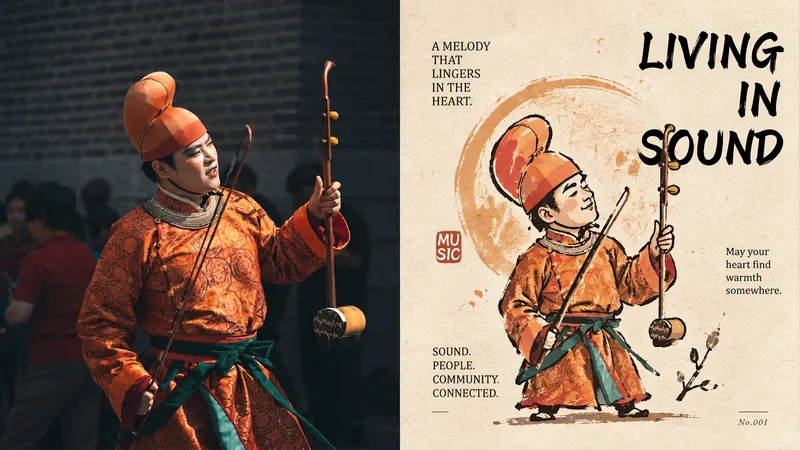
Imagexiaoxiaodong P320 Silhouette
For turning an ordinary photo into a distinctive character captured by an artist—not a commercial mascot. The top half is the original image; the bottom half first establishes a silhouette, then layers broken, overflowing, and not-quite-closed gesture lines over it. Proportions may be rounded or slightly distorted. A circle, star, or sprig of a plant can support the identity, but must not become the background. Ink lines sit on paper, loose yet controlled, forming a small collectible icon. Use a warm, limited palette: warm yellow, ochre, soft orange, off-white, dark brown, and deep red, with a small amount of cool color for balance. Avoid smooth vector shapes, excessive retouching, cute IP, and complete scenes.
 Image
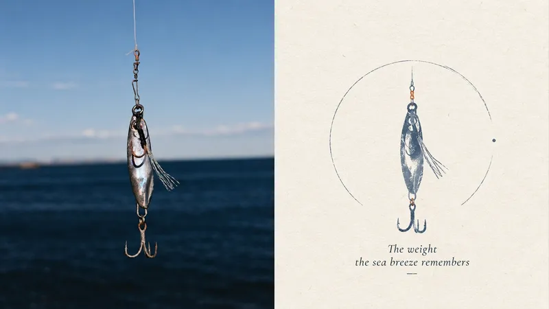
ImagePoetic Mark | xiaoxiaodong P319
Ideal for turning an ordinary photo into a private poetic mark on white paper. The upper half shows the original image; the lower half keeps only a silhouette, a set of proportions, or a gesture. It can be pared back to near abstraction, with a quiet touch of surrealism. A very small label, number, or handwritten word may appear as a second layer of metaphor rather than an explanation. The materials are colored pencil, crayon, and paper grain. The palette uses warm white with one main color and one supporting color for a low-stimulation effect. Keep the symbol small and place it within a broad field of psychological space. Avoid complete scenes, piles of annotations, perfect geometry, and noisy colors.
 Image
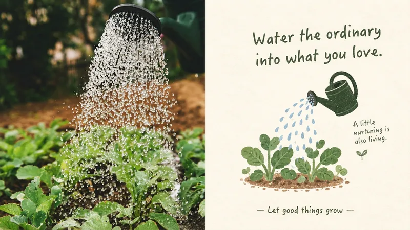
ImageLife Trace | xiaoxiaodong P318
Designed to turn an ordinary photo into a visual expression of everyday life worth remembering. The upper half shows the original photo; the lower half distills a pose, plant, pet, architectural detail, or household object into a clear, rounded little emblem with a subtle handmade feel. Soft gouache, naive linework, colored-pencil grain, and paper texture coexist. The symbols are small, floating in clean negative space, while the text resembles a small label from a lifestyle brand. The palette is fresh and warm: warm cream, light beige, plant green, misty blue, dusty pink, soft coral, and light apricot. Avoid complete stories, complex backgrounds, excessive cuteness, and template-like icons.
 Image
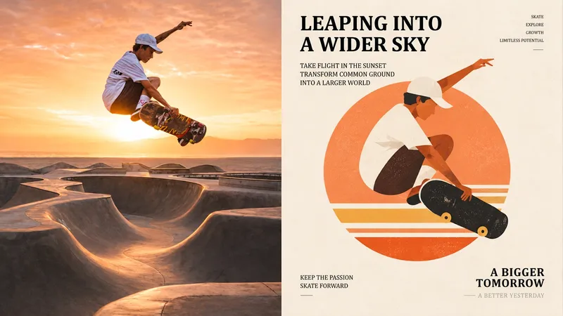
ImageGeometric Composition | xiaoxiaodong P322
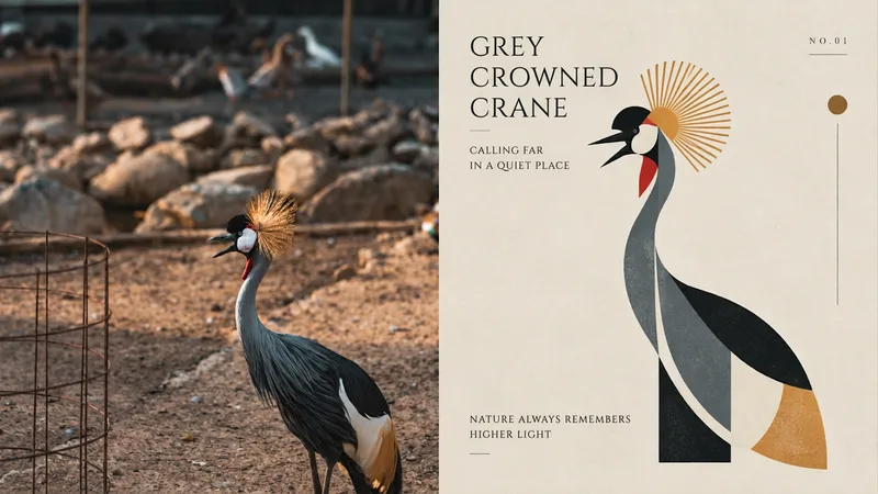
Turn an ordinary photo into a small graphic for an arts organization, cultural brand, or travel keepsake. The top half shows the original photo; the bottom half reorganizes the subject with circles, rectangles, arcs, and triangles—first forming a balanced composition, then allowing viewers to recognize the original object. You can add a ring, a horizontal line, or a structural axis to aid recognition. Extract a limited palette from the original image: clear blue, cream white, warm yellow, coral orange, soft green, peach pink, and dark brown. Build a system with a primary color, supporting colors, and accents. Keep the mark small and the negative space generous. Avoid details, complete scenes, too many supporting shapes, and generic app icons.
 Image
ImageChapter P321 | xiaoxiaodong
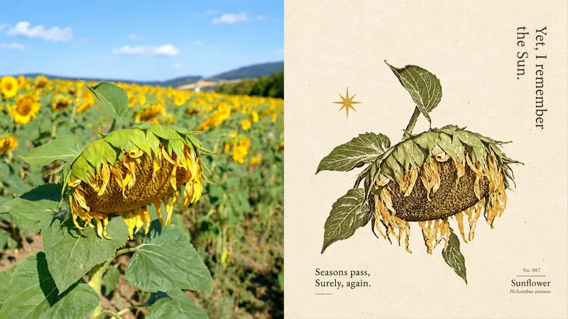
Ideal for turning an ordinary photo into an isolated mark quietly placed in blank space. The upper half shows the original photo; the lower half resembles a small illustration from an old herbal atlas, folk manual, or private seal: irregular hand-drawn ink lines, solid ink blocks, and organic forms work together to carry the subject’s visual essence. Starbursts, botanical patterns, or small abstract marks should serve the subject rather than form a background. The symbol stands alone in generous blank space, like a page from an old diary. Keep the palette warm and restrained: warm white paper, deep brown ink, soft gray-green, misty blue, and light brown. Avoid complete illustrations, polished vectors, commercial badges, and piled-on decoration.
 Image
ImageLife Note | xiaoxiaodong P307
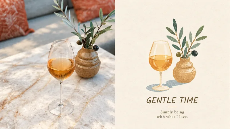
Ideal for turning an ordinary photo into a memorable everyday moment. The top half is the original photo; the bottom half features soft, oversized color blocks and slightly awkward hand-drawn outlines, with pencil, pastel, and dry-brush textures left visible on the paper. Icons are small and slightly float in the open space, while the text feels like a tiny label from an independent lifestyle brand. The palette feels lived-in: creamy white, misty blue, sage, mustard yellow, coral orange, and soft pink—bright but not harsh. Avoid complex scenes, narrative illustrations, commercial cartoon logos, excessive cuteness, 3D, and templates.
 Image
ImagePaper-Cut Totem | xiaoxiaodong P305
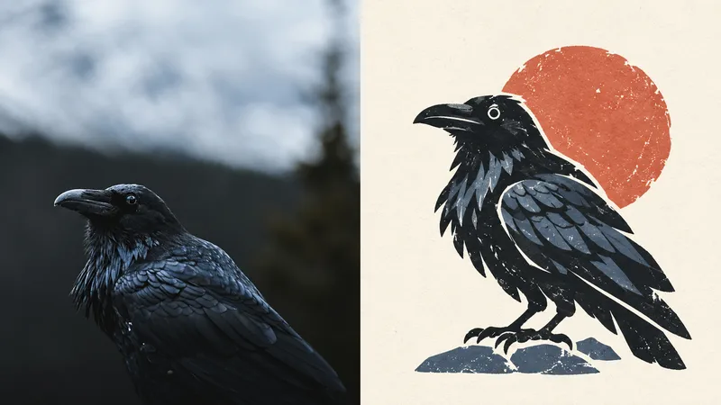
Ideal for turning an ordinary photo into a cultural symbol that remains recognizable when reduced in size. The subject is compressed directly into a standalone paper-cut visual totem, with form taking priority: bold outer contours, a few geometric shapes, and rounded edges, with slightly exaggerated proportions and a hint of charming awkwardness. Retain irregular cut edges, white paper borders, screen-print grain, uneven ink coverage, and slight color-registration shifts. Use a single core symbol with generous negative space for a stable, brand-recognizable feel. Keep the palette vivid but easy on the eyes: coral, warm yellow, botanical green, misty blue, cream, and brick red, divided into primary, secondary, and accent colors. Avoid complex textures, full figures, commercial cartoon logos, smooth vector art, gradients, and cheap candy colors.
 Image
ImageGeo Mark | xiaoxiaodong P303
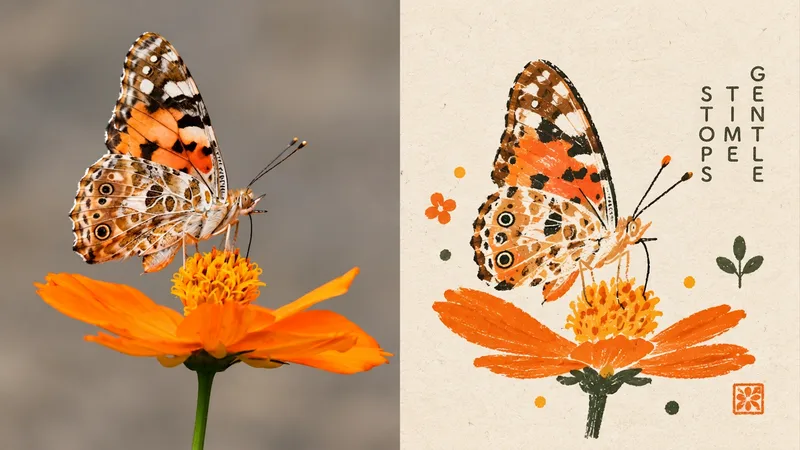
Ideal for turning an ordinary photo into the core graphic of an arts institution or cultural brand. The top half shows the original image; the bottom half retains only the subject’s silhouette, structural relationships, or direction, rebuilding them into a geometric identity mark with circles, rectangles, triangles, and negative space. The palette is a refined selection of brand colors drawn from the original image: one main color, one supporting color, and a small accent color—bold but restrained. The mark is small, centered or slightly offset, like a logo displayed in an art book, with narrow modern editorial lettering. Avoid realism, cartoon icons, gradients, 3D effects, decoration, and logo templates.
 Image
ImageFolk Art, New Chapter
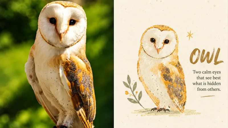
Ideal for turning an ordinary photo into a cultural symbol somewhere between an old picture book and an independent brand. The upper half is the original image; the lower half reworks the subject with wobbly hand-drawn outlines, large areas of flat color, and simplified geometry. Proportions can be exaggerated while still clearly evoking the original. A tiny related symbol may be added, but it must not grow into a scene. Preserve the feel of gouache, crayon, and Riso misregistration. Use 2–5 colors drawn from the original image—warm, bright, and full of character, but not sugary or cartoonish. Keep the emblem small, leave plenty of negative space, and place text at a distance from the subject. Avoid full character illustrations, commercial logos, cartoon IP, 3D, and smooth vector graphics.
 Image
ImageRelic | xiaoxiaodong P301
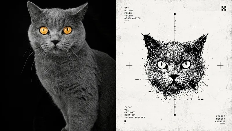
Ideal for turning an ordinary photo into something between an early computer icon and an underground magazine mark. The top half is the original image; the bottom half is an anonymous digital relic in pure black and white, with coarse dithering, halftone dots, jagged low-resolution edges, and a touch of information loss. Keep only the strongest identifying feature as a totem. The symbol should be small and centered, with clean space around it, while the text resembles an old system label. The mood is calm, mysterious, and restrained. Avoid complex illustrations, game scenes, cartoon logos, gradients, colorful interfaces, modern commercial icons, and 3D.
 Image
ImagePoetic Mark | xiaoxiaodong P293
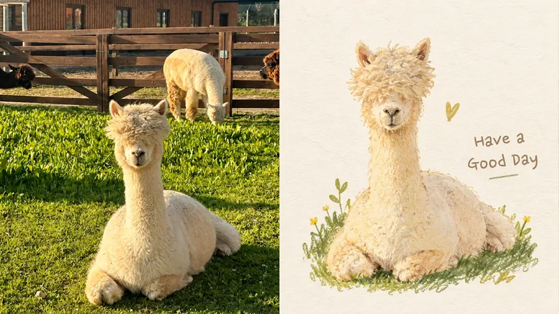
Ideal for turning an ordinary photo into a story-rich handmade imprint. The original photo occupies the upper half; the lower half features a simple, rounded, slightly clumsy, not-perfectly-symmetrical symbol of the original object. It may include a tiny expression or small gesture, but remains the original object rather than becoming a new mascot. Retain paper grain, gouache texture, color bleeding, and Riso misregistration. Place a single symbol in generous white space, with lettering that feels like a mark from an independent zine. Use a warm, limited palette such as warm ivory, misty blue, sage green, soft coral, cream yellow, and warm brown. Avoid realism, smooth vector graphics, 3D, template icons, and excessive cuteness.
 Image
ImageSoft Totem|xiaoxiaodong P291
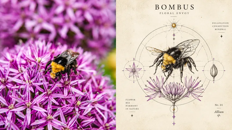
Ideal for turning an ordinary photo into a preserved memory symbol. The top half shows the original photo; the bottom half distills the subject into a rounded, soft, slightly imprecise organic shape, like a blend of journal doodles and marks from a vintage picture book. Pencil, crayon, and dry-paint textures remain on the paper. A single symbol floats in ample negative space, with fine, light lettering that leaves room to breathe around the symbol. The palette uses cream, warm beige, olive, honey yellow, soft brown, burgundy, and misty blue, with just a touch of vivid color for emphasis. Avoid complex scenes, vector icons, 3D, cartoon IP, and excessive refinement.
 Image
ImageArchive Emblem | xiaoxiaodong P288
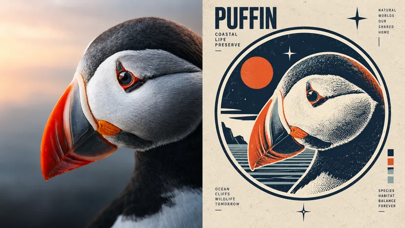
Turn an ordinary photo into the small imprint beside a museum collection number. The upper half shows the original image; the lower half keeps only an outline, a set of structural relationships, and one memorable detail, rendered in fine-pen engraved lines on warm ivory or parchment tones, with an optional halo or axis. Use warm ivory, parchment, ochre, dark brown, and ink black as the main colors. Cobalt blue, vermilion, or teal should appear only as very limited research markings. Let the lettering feel like an index from an old book or a museum label. Avoid pages filled with handwriting, commercial icons, tech interfaces, cartoons, and complete photorealism.
 Image
ImageEra Badge | xiaoxiaodong P283
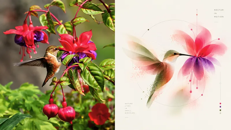
Ideal for turning an ordinary photo into an institutional commemorative badge. The top half preserves the original image; the bottom half compresses the subject into a complete circular, shield-shaped, or ring-shaped composition. Hard-edged color blocks, halftones, and color-registration misalignment create the feel of a badge that has been officially awarded. The badge is small and self-contained, with generous whitespace around it. The lettering uses a compact institutional sans serif, like a mission label. Colors are vivid but limited, reworked from the original image into deep blue, cosmic purple, warm red, orange-yellow, gold, and paper white, with a touch of technological grandeur and history. Avoid complete scenes, cinematic sci-fi, cyberpunk, 3D Logos, neon, and commercial icons.
 Image
ImageSoft Blur xiaoxiaodong
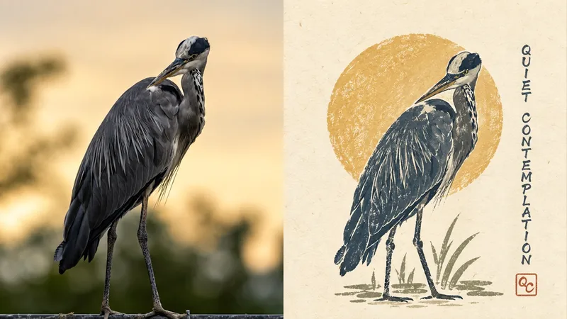
Ideal for reducing an ordinary photo to a soft, distanced visual symbol. The original image appears in the upper half; below, the subject becomes an organic abstract outline made from translucent layers, soft-focus diffusion, and a few pixel fragments. The symbol is complete, centered, and modest in scale, with clean space around it and only a tiny, precise sans-serif caption beside it. The palette uses low-contrast milky white, nude pink, misty pink, gray-green, pale olive, and light blue—like colors filtered through soft light. Avoid literal object rendering, complete scenes, commercial illustration, neon, strong gradients, and cartoon styles.
 Image
ImageNaive Badge | xiaoxiaodongP275
Ideal for turning an ordinary photo into a warm, personal handmade badge. The top half shows the original photo; the bottom half compresses the subject into a small visual symbol with a sense of memory, like a handmade badge, personal mark, or independent brand totem. Its form is slightly awkward, asymmetrical, and handmade. The subject stands alone like a small badge, seal, or icon, with generous blank space around it. Simplified rounded shapes, naturally varied hand-drawn outlines, limited color blocks, and a few decorative elements create a look of matte gouache, colored-pencil and crayon grain, dry-brush strokes, and paper texture. Colors are soft and low-stimulation, like pigment absorbed into paper. Avoid complete scenes, commercial logo design, standard icon systems, smooth vectors, and excessive cuteness.
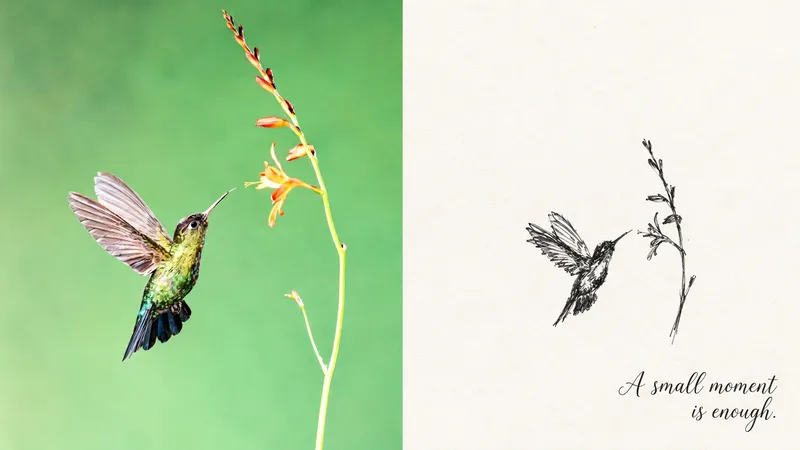 Image
ImageTiny Private Symbol | P294
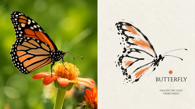
Turn an ordinary photo into a tiny private symbol. The upper section contains the original image; the lower section is about 80% to 95% blank, leaving only one outline, pose, or relationship that must be remembered. The lines may be hesitant, rough, repeated, and unfinished. By default, use only black, gray, and paper white, with at most one tiny accent color drawn from the photo. Text can be omitted entirely; if included, it should remain weaker than the symbol. Avoid complete figures, complete scenes, decoration, cute stickers, smooth vectors, and anything added just to fill the frame.
 Image
ImageClosed Cipher | xiaoxiaodong P297
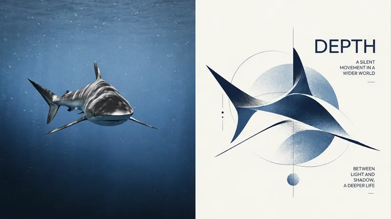
Ideal for turning an ordinary photo into a private mark with the feel of an art brand. The upper half is the original image; the lower half retains only the minimum information needed to identify the subject—an outline, a pose, or a direction—so the form breaks, fades, and remains incomplete, inviting viewers to close the image in their own minds. Use directional strokes reminiscent of calligraphy or charcoal, a small number of dark lines, limited colors, and clear negative space. The symbol may be tiny, off-center, or cropped at the edge; use black and gray on warm white paper, accented by one emotional color drawn from the original image. Avoid complete depictions, commercial icons, cartoons, excessive geometry, and smooth vector forms.
 Image
ImageTotem | xiaoxiaodong P304
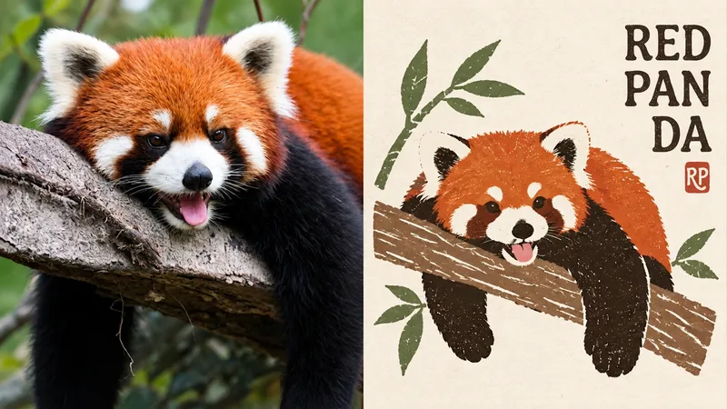
Turn an ordinary photo into a visual symbol for an art institution or high-end magazine. Compress the photo’s core spirit, subject features, and emotional tone into a standalone abstract logo / icon. Rather than explaining literally, it is built from a few organic forms, circles, rectangles, irregular color blocks, and a single gestural fine line. Organic and geometric forms, order and improvisation coexist, with partial occlusion, misalignment, and cuts allowed. The result may look spontaneous but remains highly controlled. Use one core symbol with precise proportions and generous negative space; set it against soft neutral tones with a single, highly recognizable accent color, such as deep blue, vermilion, forest green, warm orange, or soft pink. Avoid complete human portraits, realistic illustrations, complex scenes, bright childlike colors, technological gradients, and meaningless geometric collages.
 Image
ImageFolk P306 | xiaoxiaodong
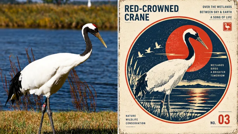
Ideal for distilling an ordinary photo into a folk pattern designed to be preserved for a long time. The top half shows the original image; the bottom half uses a paper-cut silhouette, broad areas of flat color, and a few interior carved lines. Forms may overlap slightly, preserving the naive quality of folk motifs. Symbols are small and blank space is abundant, with an off-center layout and paper texture and misregistration along the edges. Text appears as a small note beside a handmade stamp. The palette is simple yet lively: powder blue, off-white, botanical green, coral red, warm yellow, and ochre, with clear visual hierarchy. Avoid complete scenes, smooth vector graphics, commercial cartoon styling, 3D, and a cheap merchandise aesthetic.
 Image
ImageCiv. Emblem | xiaoxiaodong P284
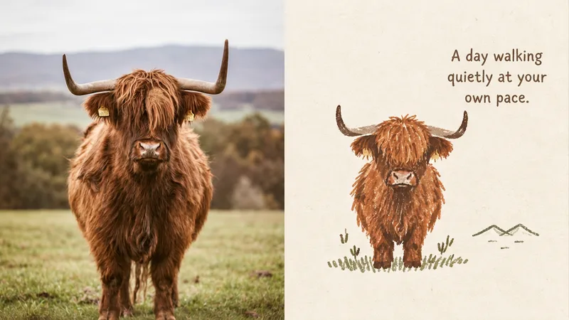
Ideal for turning an ordinary photo into a preserved symbol of civilization. The top half shows the original image; the bottom half places the subject in a stable circular, shield-shaped, or square frame, like a miniature monument. A few orbit lines, a horizon, or a solar arc may be added. The symbol is small in scale but carries monument-like weight. Retain halftone dots, ink spread, and uneven printing. Use a retro-futurist warm-cool contrast: deep space blue against solar yellow, warm red, or orange. Set the lettering in a compact institutional sans-serif. Avoid complete scenes, cinematic sci-fi, 3D, cyberpunk, app logos, and souvenir badges crowded with elements.
 Image
ImageOld Sigil | xiaoxiaodong P290
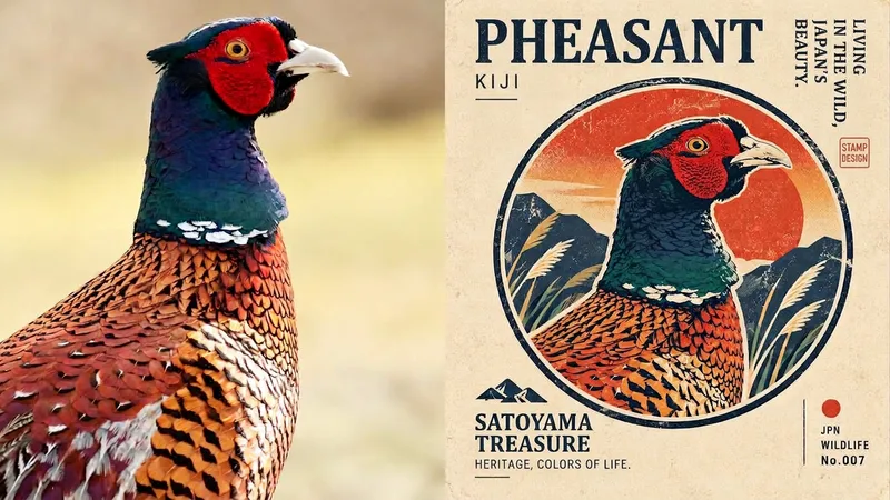
Ideal for turning an ordinary photo into a warm little totem. The top half shows the original image; the bottom half uses an uneven, slightly shaky hand-drawn outline with limited flat color, along with the imperfections of old printing: ink bleed, misregistration, and visible paper fibers. The symbol is small, with generous blank space preserving a touch of loneliness, while the text resembles a handwritten collection number. The palette is a limited, warm vintage selection: faded orange, washed blue, olive green, warm off-white, ink black, and soft red. Avoid full illustrations, commercial logos, standard mascots, smooth vector graphics, and 3D.
 Image
ImageScientific Badge | xiaoxiaodong P285
Ideal for turning an ordinary photo into a scientific badge worthy of a museum collection. The upper half shows the original image; the lower half compresses the subject into a bold, simplified silhouette with a few engraved lines, halftone dots, and uneven ink, like a graphic from an old stamp or aviation archive. The symbol is small, surrounded by generous negative space, with text formatted as a compact archive number or short label. Colors are vivid and dignified, reworked from the original image into deep blue, cosmic blue, warm red, orange-yellow, ivory, ink black, or teal green, with a sense of the print era. Avoid complete scenes, cinematic sci-fi, neon, modern commercial logos, muddy gray-muted palettes, and the feel of a tourist souvenir.
 Image
ImagePixel Specimen | xiaoxiaodong
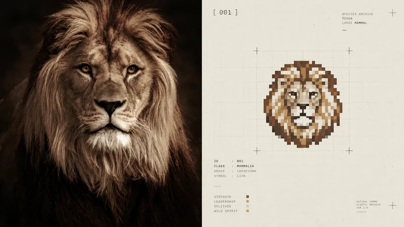
Ideal for turning an ordinary photo into a small signal on an archival page. The original image appears on top; below it, the subject is distilled into an abstract pixel badge with a hard grid, minimal tonal levels, and almost no dithering—like a pixel specimen preserved in a collection book. The badge is very small, set in generous warm-white or light-gray negative space, with an optional tiny monospaced number beside it. The overall design uses low-saturation industrial neutrals, retaining only one sparse signal color derived from the original image. Avoid complete scenes, pixel illustrations, game interfaces, icon collections, nine-grid templates, noisy retro effects, and cheap tech aesthetics.
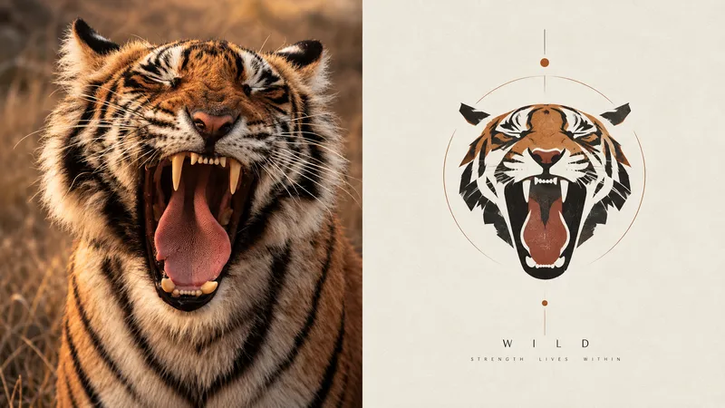 Image
ImageGeo Mark | xiaoxiaodong P277
Turn an ordinary photo into a small, modernist visual mark. The original image appears above; below, the subject is distilled into a geometric symbol with a distinct brand identity, retaining only one contour, one set of proportions, one pose, and one memorable detail. The subject resembles a small visual mark from an art book, architectural brand manual, or exhibition identity, floating in generous white space. A few fine lines, supporting geometric relationships, or abstract structures may be added. It uses the language of modernist graphic design—geometric contours, flat color blocks, simple proportions, and clear boundaries. Facial features are minimized for people, and details are reduced for buildings, leaving only the most symbolic forms. Avoid complex illustrations, complete scenes, cartoon styling, generic app icons, and the feel of a commercial logo template.
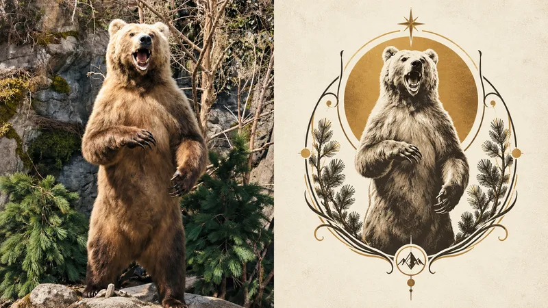 Image
ImageNouveau Badge · xiaoxiaodong
Ideal for turning an ordinary photo into a visual badge in the Art Nouveau style. The top half shows the original photo; the bottom compresses the subject into a sophisticated visual symbol, totem-like logo, or artistic badge with symbolic meaning. A standalone symbol is reconstructed using minimal lines, decorative curves, geometric structures, and symbolic elements. The subject resembles a carefully designed brand mark, with a small scale, generous negative space, and a strong visual focal point. The result is stable, balanced, and restrained. Use black, gray, warm white, or a low-saturation background, extracting just one of the original image’s most vibrant colors as the sole accent. Preserve delicate linework, a subtle printmaking feel, and paper texture. Avoid complete scenes, excessive botanical detail, generic logo templates, commercial icon styling, and cheap decoration.
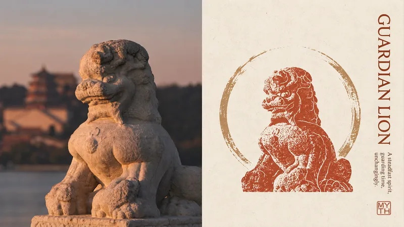 Image
ImageEast Totem | xiaoxiaodong P270
Ideal for transforming an ordinary photo into a cultural totem with an Eastern spirit and aesthetic. The upper half shows the original image; the lower half distills the subject into a symbolic visual mark, like a redesigned cultural seal, brand logo, or ancient totem. The subject appears as a small collectible symbol, resting quietly in a large expanse of negative space. It may be centered, offset, or partially cropped. Simple geometric relationships, delicate line engraving, flat color blocks, and a subtle printmaking texture evoke the handcrafted traces of antique paper, xuan paper, seal carving, and woodblock printing. The palette leans toward a dignified, restrained Eastern color scheme of cinnabar red, antique gold, warm ivory, ink black, celadon green, and more. Avoid complete scenes, piled-up traditional elements, a tourist-souvenir feel, and excessive decoration.
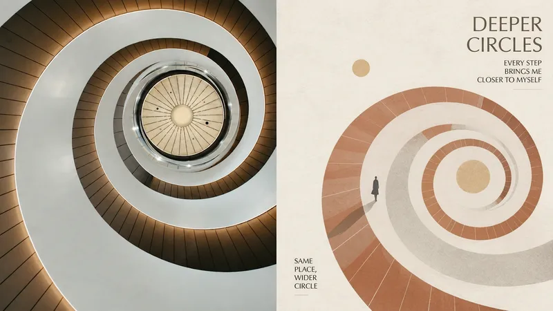 Image
ImageGeo Memory | xiaoxiaodong
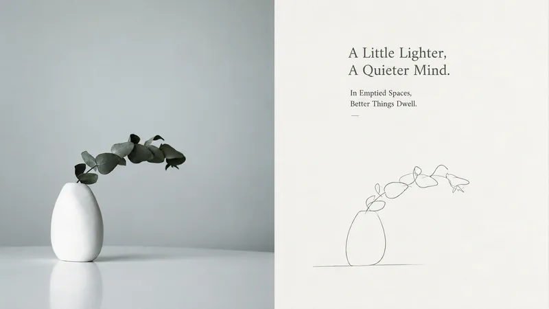
Suitable for turning photos into reassembled fragments of memory. The top half shows the original image; the bottom half retains only the core forms that evoke identity and emotion, using triangles, rectangles, circles, and fine lines to express direction, distance, and relationships. Geometry can repeat, shift, overlap, and fade, but it is not decorative. Paper texture and slight printing imperfections are preserved. Avoid complete scenes, decorative geometry, and overly hand-drawn elements.
 Image
ImageSilent Line | xiaoxiaodong P257
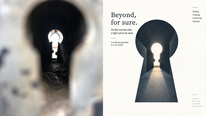
Ideal for reducing a subject to a minimalist emotional symbol. The upper half shows the original image; the lower half removes everything down to the fewest clues, letting viewers complete the image themselves. The subject can be very small or appear only as a partial outline. The lines feel like a quiet handwritten note, with pauses and room to breathe. Use no more than a few supporting lines, and make sure each one serves the mood. The goal is to make the image fall apart if even one line is removed. Avoid complete outlines, complex scenes, and mechanically uniform lines.
 Image
ImageFlat Key | xiaoxiaodong P253
Ideal for reducing a photo to a highly simplified flat symbol. The top half shows the original image; the bottom keeps only the outer contour, structural relationships, and emotional cues. Layered color blocks and geometric simplification create memorable visual anchors. The subject can be centered, offset, cropped, or suspended. The style is modern flat illustration: simple shapes, soft contours, limited color blocks, and a subtle hand-drawn feel. No realistic textures or complex lighting. Avoid filling the frame or including secondary objects.
 Image
ImageMood Pixels | xiaoxiaodong P249
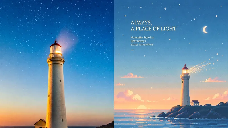
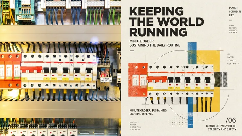
Suited to turning ordinary scenes into a quiet moment in a retro game world. The upper half is the original photo; the lower half reduces information while preserving its spirit and silhouette. The subject may be off-center, farther away, or cropped. The sky, mist, water, or blank space carries the mood. Colors from the original image shift to misty blue, pale cyan, mint green, creamy yellow, warm beige, and soft pink. Clear and warm—not gray, dirty, or highly saturated. Avoid ordinary pixel filters and fully packed scenes.
 Image
ImageOld Trip · xiaoxiaodong P248
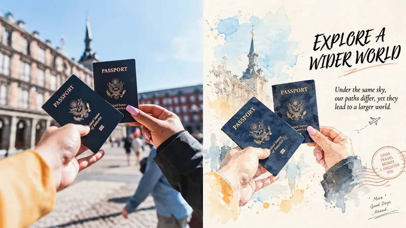
Suitable for turning a single photo into a preserved page from an old travel journal. The original photo fills the upper half; the lower half actively removes unrelated objects, keeping only clues that convey its spirit. The subject may be small, off-center, or close to the edge. Negative space becomes air, distance, and time. Transparent watercolor, diluted ink, and paper grain retain natural diffusion and pauses. Stamps and collage serve only as minimal emotional cues. Avoid showing a complete landscape or adding excessive decoration.
 Image
ImageNew Collage | xiaoxiaodong P246
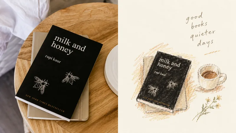
Turn an ordinary photo into a conceptual poster. The upper half remains a recognizable version of the original photo; the lower half does not restate the scene, but keeps only one subject and turns it into a new compositional collage using rectangles, circles, axes, and modular color blocks. The subject can be small, off-center, or cropped. Geometry serves meaning rather than decoration. Paper texture, halftone dots, and registration shifts remain in the design area. Avoid piling on concepts, filled backgrounds, cyberpunk, smooth vectors, and plastic-like 3D.
 Image
ImageGPT2 x Crayon Visual Diary
Ideal for turning photos into private visual diaries: travel journals, everyday moments, and independent publishing. The upper half preserves a recognizable original photo; the lower half keeps only one movement or relationship worth remembering. Keep the subject small—it can be off-center, close to the edge, or cropped. Let the blank space carry air and time. Use loose oil pastels and crayons, with open contours, broken edges, and the friction of paper grain and wax still visible—deliberately stopping short of finished. Draw colors from the original image’s color temperature: warm ivory, soft blue-gray, plant green, terracotta, apricot brown, and dusty pink. Quiet, intimate, and slightly clumsy, yet mature. Avoid filling the frame, smooth detailed rendering, dark brown aging effects, fluorescent colors, and overly sweet candy tones.
 Image
ImageGPT2 x Specimen Poetics Atlas
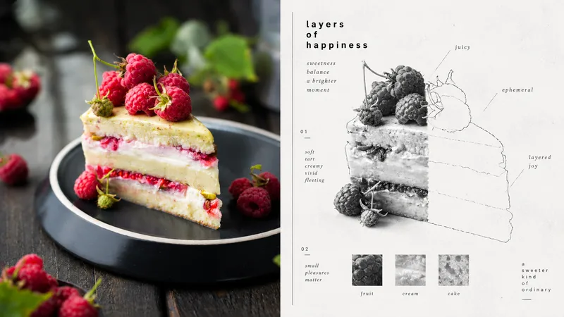
Ideal for turning an object into a poetic classification page styled like a museum publication: visual research, exhibition catalogs, and concept posters. The image shows only a precise black-and-white photograph of part of the subject; the missing portion is completed with a large area of untouched blank space and a fragile, imperfect hand-drawn outline. A few square material samples serve as evidence. Feeling words label intangible qualities, not anatomical details. Extreme negative space, restrained asymmetry, small, coarse lowercase sans serif type, a fine border line, black-and-white photographic grain, and slight printing errors. Quiet, cerebral, gentle, archival. Avoid full-color illustrations, dense catalog grids, cute stickers, smooth vector graphics, and explanatory infographics. The original is in English and is preserved verbatim in zh-CN.md.
 Image
ImageGPT2 x Blue Pen Sketch
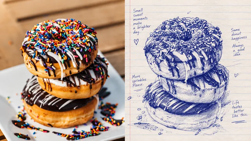
Ideal for turning photos into private observation pages from a journey: journal pages, sketch publications, and exhibition vignettes. The upper half preserves a recognizable original photo; the lower half uses only an ordinary blue ballpoint pen and cheap lined paper. The lines must pass through the drawing. Light and dark come from structural hatching, not digital gray. Some areas are extremely dense, then the pen suddenly stops nearby. Pressure, hesitation, repeated corrections, and the search for a line all remain visible. The subject may be off-center, cropped, or partly missing. If there is text, it must be a few words written casually with the same pen. Avoid polished illustrations, complete backgrounds, photo outlines, smooth shading, tidy vectors, and commercial sketches.
 Image
ImageGPT2 x Ochre Minimal Axon
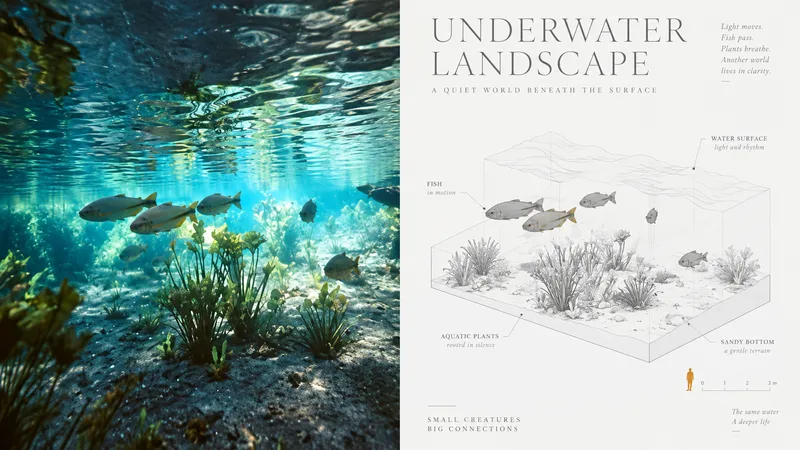
Ideal for organizing personal photography, independent publishing, exhibition studies, and lifestyle-oriented visual creation. Even images with ordinary compositions, cluttered backgrounds, or small subjects can regain focus through reduction, reorganization, cropping, and changes in scale—rather than simply applying a filter. The overall look combines Vignette + Negative Space + Axonometric Diagram + Monochrome Grayscale + Single Ochre Accent to create a refined architectural-diagram aesthetic: small yet precise, bright yet restrained, rational yet artistic.
 Image
ImageGPT2 x Blueprint Breakdown
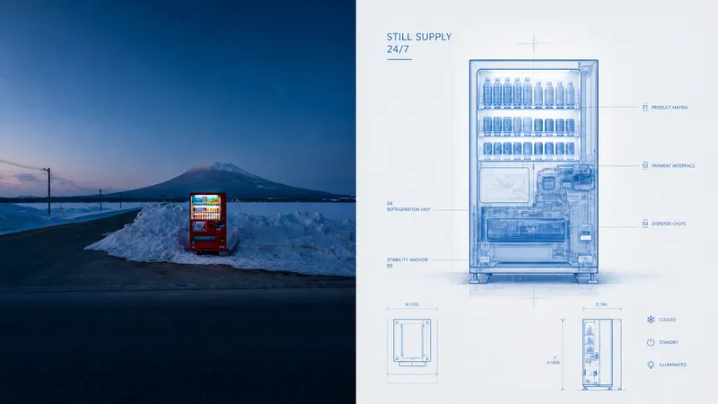
P048 has recently refined a set of poster prompts centered on “structural breakdown x transparent blueprints,” with a highly analytical, refined feel. The resulting images evoke the exploratory spirit of scientific archives and industrial aesthetics. If you need these prompts, feel free to leave a comment! The idea is this: ordinary photos can only record what an object “is.” But if you could open up its surface to reveal hidden connections, movement paths, spatial layers, and operating logic, the image would immediately gain a deeper sense of inquiry into the nature of things. Many high-end industrial design manuals and scientific archives use precise perspective and diagrams to give everyday objects a sophisticated, rational beauty. After multiple rounds of structural logic and line-art adjustments, I combined “documentary photography” with “precision engineering diagrams” to create this poster Skill.
 Image
ImageGPT2 x Impasto x Emergence
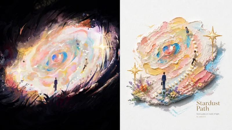
046 recently refined a poster prompt set centered on “3D impasto oil painting x vivid miniature landscapes.” The generated images have a bright, soothing artistic quality and tangible physical texture. If you need prompts, feel free to leave a comment! The background is this: many AI oil painting styles can look heavy, dark, or muddy, while 3D rendering often lacks the warmth of hand painting. By combining **sculpture-like miniature forms** with **clear oil paint built up with palette-knife strokes**, and using large areas of pure warm white as a base, this approach creates a fresh aesthetic experience that balances physical substance with a bright, translucent clarity. After repeatedly fine-tuning the lighting and brushwork, I combined “documentary photography” with “vivid impasto miniature landscapes” to develop this poster Skill.