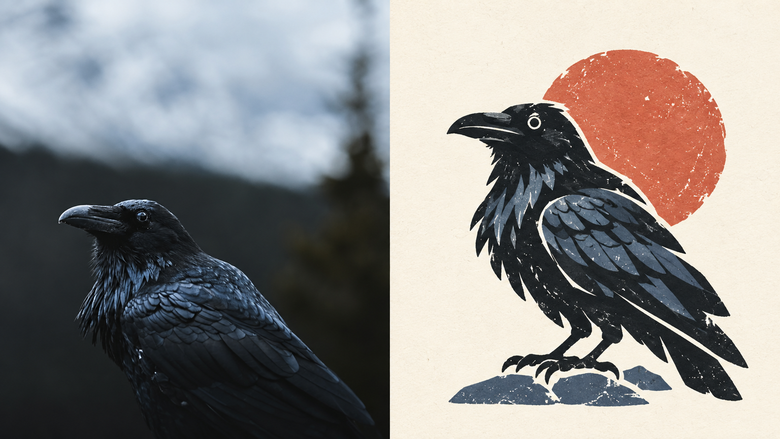
Paper-Cut Totem | xiaoxiaodong P305
Created by xiaoxiaodong
Paper-Cut Totem | xiaoxiaodong P305
Created by xiaoxiaodong
Showcase
Description
Ideal for turning an ordinary photo into a cultural symbol that remains recognizable when reduced in size. The subject is compressed directly into a standalone paper-cut visual totem, with form taking priority: bold outer contours, a few geometric shapes, and rounded edges, with slightly exaggerated proportions and a hint of charming awkwardness. Retain irregular cut edges, white paper borders, screen-print grain, uneven ink coverage, and slight color-registration shifts. Use a single core symbol with generous negative space for a stable, brand-recognizable feel. Keep the palette vivid but easy on the eyes: coral, warm yellow, botanical green, misty blue, cream, and brick red, divided into primary, secondary, and accent colors. Avoid complex textures, full figures, commercial cartoon logos, smooth vector art, gradients, and cheap candy colors.
Recommended by
Dancang
Why we love this skill
Transforms photos into distinctive paper-cut totems with bold contours, geometric color blocks, negative space, screen-print grain, and paper-fiber texture.
Best for
For creators who want to turn photo subjects into distinctive cultural symbols or brand visuals.
How to use this Skill
Provide your input
Provide a photo or image with a clear, recognizable subject.
Run the Skill
Refine the subject into a single, standalone paper-cut visual totem with bold contours, simple shapes, negative space, and paper and screen-print textures.
Review your result
Receive a finished PNG image whose subject remains easy to recognize at a small size, with vivid yet restrained colors and a strong emblem-like quality.
Related Skills
View all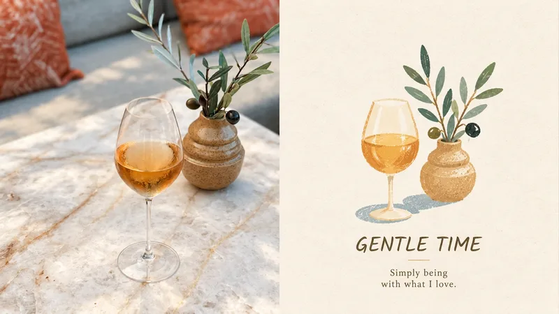 Image
Life Note | xiaoxiaodong P307
Ideal for turning an ordinary photo into a memorable everyday moment. The top half is the original photo; the bottom half features soft, oversized color blocks and slightly awkward hand-drawn outlines, with pencil, pastel, and dry-brush textures left visible on the paper. Icons are small and slightly float in the open space, while the text feels like a tiny label from an independent lifestyle brand. The palette feels lived-in: creamy white, misty blue, sage, mustard yellow, coral orange, and soft pink—bright but not harsh. Avoid complex scenes, narrative illustrations, commercial cartoon logos, excessive cuteness, 3D, and templates.
 Image
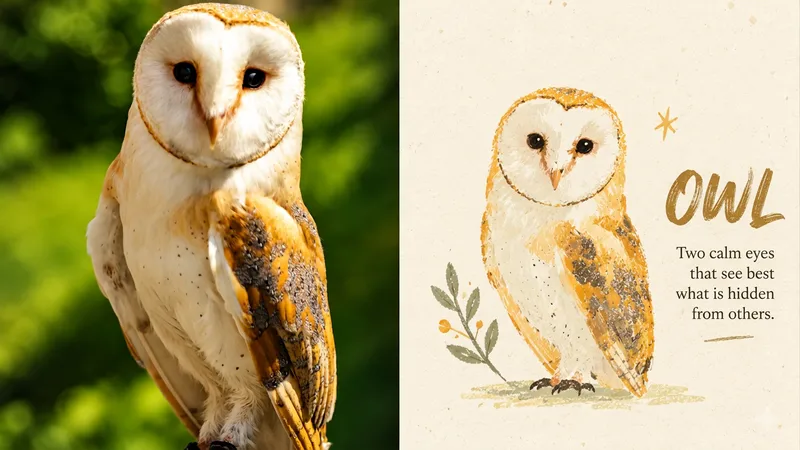
Poetic Mark | xiaoxiaodong P293
Ideal for turning an ordinary photo into a story-rich handmade imprint. The original photo occupies the upper half; the lower half features a simple, rounded, slightly clumsy, not-perfectly-symmetrical symbol of the original object. It may include a tiny expression or small gesture, but remains the original object rather than becoming a new mascot. Retain paper grain, gouache texture, color bleeding, and Riso misregistration. Place a single symbol in generous white space, with lettering that feels like a mark from an independent zine. Use a warm, limited palette such as warm ivory, misty blue, sage green, soft coral, cream yellow, and warm brown. Avoid realism, smooth vector graphics, 3D, template icons, and excessive cuteness.
Information
- Version
- v3
- Last updated
- Runtime credits
- Usage-based
- Models
- Auto
- Use cases
- Images & design
- What you get
- Image
- Visual styles
- FlatPrintmakingPaper art