Notion-Style Art Studio
Notion-style visuals for products & photos
Description
Recommended by
淡苍
Why we love this skill
Turns intent directly into images in a distinctive editorial illustration style, covering illustrations, posters, infographics, and photo transformations with consistent composition, typography, and style checks.
Turn your ideas into images with a handmade feel. This Skill recreates the widely loved illustration language of the Notion website: bold black hand-drawn ink lines, fine halftone dots, generous white space, and restrained monochrome accents—each image uses just one color: red, blue, or yellow. It deliberately avoids the generic flat vector illustrations and Corporate Memphis style common today, offering a texture closer to editorial magazine illustration. What it can do: · Illustration assets — Feature icons, small still-life illustrations, interface mockups, close-up portraits, multi-person narrative scenes, and cohesive sets of illustrations generated in one go · Posters — Quote posters, personal reflection cards, event announcements, and covers for WeChat Official Accounts and Xiaohongshu · Information design — Product hero images, feature overview grids, process diagrams, and hand-drawn data charts · Photo transformations — Add ink-line illustrations to your photos or turn an entire photo into an ink-and-halftone image · Custom creations — Apply this style to any scene you have in mind Chinese copy can be handled in two ways: short phrases can be generated directly in the image, while longer copy gets a clean text area for you to add later, giving you more control over the result. When your intent is clear, it generates the image directly. When you are not sure what you want, it gives you options instead of making you fill out a long form.
Related Skills
View all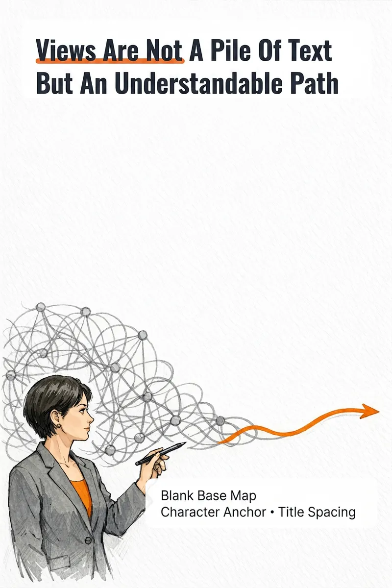
IP Hand-Drawn Visual Consultant
It's not that you can't write content; you often get stuck at the last step: what kind of image should this idea, method, or story become to feel like you? The IP Hand-Drawn Visual Consultant breaks down your content expression into a suitable visual form, then gives you a practical visual + text solution. You will receive: - A judgment of whether the content suits an opinion diagram, method diagram, or story diagram; - A hand-drawn visual direction that matches your field and style; - A copy confirmation form to lock in text after review; - A hand-drawn visual base map without text, or a ready-to-use text-free image prompt; - A layout guide: where to place titles, steps, and key text, and how much space to leave. Why provide a text-free base map first? Chinese text needs to be accurate and editable. Instead of letting the image generation model randomly 'draw' text, we first design the image, characters, or scene with white space for text, and then you overlay the confirmed copy using your familiar tools. This is suitable for those who want to first verify if they need a personal visual expression: consultants, lecturers, coaches, knowledge content creators, or those just starting to build their personal brand. This skill currently can do: a single, single-platform content visual solution; one text-free preview base map or text-free prompt; copy confirmation and layout guide; extract hand-drawn IP anchors from photos if available; use professional props, scenes, or abstract symbols to build recognition without photos. Currently does not: generate multiple images or content card sets at once; adapt to multiple platforms simultaneously; save IP archives across tasks; directly generate publishable final images with accurate Chinese text; auto-publish to any platform. If after the experience you naturally need multi-image, multi-platform, long-term fixed character images or serialized columns, those are scenarios better addressed by the subsequent Pro and Max versions. This skill will first complete this single experience and will not proactively upsell.

Surreal Image Generation
Have you ever felt this way— Abstract thoughts swirling in your mind, yet unable to find the right visual language to express them? Written a deep, insightful article, only to struggle endlessly for an accompanying image—ordinary photos too literal, illustrations lacking soul? Want to create a 'thoughtful' visual for your brand, only to end up with clichés that everyone else has already used? Stuck in a creative rut, scouring your asset library, only to find every image repeating yesterday's self... We desperately need a visual language that can 'read' the emotions, conflicts, and philosophy behind the text. And now, all it takes is a theme, a piece of text—leave the rest to it. What is it exactly? A smart creative tool that transforms abstract concepts and deep thoughts into surreal, wordless images with a single click. How to use it? Ridiculously simple. Enter any text: a sentence, a short essay, a philosophical proposition, or even a few fleeting keywords. Choose a ratio: 16:9, 4:3, 1:1... you decide. Click generate—and a surreal image full of philosophical depth and visual impact appears instantly. No drawing skills needed, no design experience required. You think, it sees. What makes its visual language stand out? It doesn't rely on realism or flatter prettiness. Instead, it uses the 'grammar' of surrealism to translate your thoughts: Scale paradox — a giant apple floating above a miniature city; Material alienation — books growing bones, clocks flowing into rivers; Spatial misconstruction — staircases leading to the sky, windows opening to another universe; Collage grafting — unrelated elements colliding into striking metaphors. In terms of color, it is restrained to the point of being cold—low-saturation, high-end grays as the main tone, with local high-saturation highlights at key points, creating a dreamlike detachment and silent astonishment. Every frame is clean, exquisite, and balanced, uniformly using a pure white background—extreme simplicity to accentuate extreme absurdity. Where can it be used? Art creation for inspiration — let the subconscious surface as images; Concept covers / album visuals — instantly captivating at first glance; Deep articles / poetry illustrations — image and text resonate, striking the heart; Brand visual extension — create a unique, story-rich visual identity.
Idea to Infographic
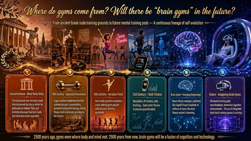
A single image, a single sentence is all it takes. Have you ever had this experience—you have a great idea and want to turn it into an infographic like the ones big accounts post, but: - Open an AI image tool, rewrite prompts over and over, and the result either has terrible layout or completely mismatched style. - Tried several prompt templates, each requiring three or four adjustments, and half an hour later you're still not done. - Want styles like financial literacy, Chinese classic, science, tech... each time you have to research colors and layouts from scratch. Now you don't have to. 「Idea to Infographic」automates all of this: You say "make an emotion management infographic," and it decides whether to use a warm Chinese style or a healing scientific style, searches and organizes core knowledge points, breaks them into 6-8 module cards, assembles the optimal prompt, and quality-checks—if it fails, it automatically redoes; if it passes, it hands it right to you. Four killer capabilities, all built-in: 🧠 **Style Engine** — Not a rigid four-choice. If your topic matches financial literacy, it automatically goes with deep blue gold; if it matches Chinese classics, it uses rice paper and ink; if it matches technology, it uses cyan neon. For topics outside these four? It automatically synthesizes a new style. Coffee encyclopedia → food warm tones; exercise and fitness → vibrant orange gray. No style it can't handle. 🔍 **Content Brain** — You give a word, it searches the web to fill out content; you give a paragraph, it extracts the core; you give nothing but a topic, it organizes everything clearly. All three input methods are supported—the simpler, the more effortless. 📐 **Layout Adviser** — Progressive ladders, side-by-side comparisons, causal chains, overarching-subcategory radiation... Five logical patterns automatically matched. Not just stuffing text into an image, but actually designing an infographic. ✅ **Self-Inspection** — After generating, it automatically checks layout, text density, image-to-text ratio, and style match. If there's an issue, it adjusts and regenerates, up to two times. You don't need to know how to write prompts; you just need to know how to speak. **Who is this Skill for?** - Social media creators who need to produce images daily but don't want to learn design. - Knowledge commerce creators who want to visualize course content but lack a designer. - Corporate trainers who need professional infographics but lack budget for outsourcing. 🔍 - Anyone who wants to turn an idea into a great image. In a word: You have the idea, it has the image. All the hassle in between, it handles for you.
Notion-Style Art Studio
Notion-style visuals for products & photos
Description
Recommended by
淡苍
Why we love this skill
Turns intent directly into images in a distinctive editorial illustration style, covering illustrations, posters, infographics, and photo transformations with consistent composition, typography, and style checks.
Turn your ideas into images with a handmade feel. This Skill recreates the widely loved illustration language of the Notion website: bold black hand-drawn ink lines, fine halftone dots, generous white space, and restrained monochrome accents—each image uses just one color: red, blue, or yellow. It deliberately avoids the generic flat vector illustrations and Corporate Memphis style common today, offering a texture closer to editorial magazine illustration. What it can do: · Illustration assets — Feature icons, small still-life illustrations, interface mockups, close-up portraits, multi-person narrative scenes, and cohesive sets of illustrations generated in one go · Posters — Quote posters, personal reflection cards, event announcements, and covers for WeChat Official Accounts and Xiaohongshu · Information design — Product hero images, feature overview grids, process diagrams, and hand-drawn data charts · Photo transformations — Add ink-line illustrations to your photos or turn an entire photo into an ink-and-halftone image · Custom creations — Apply this style to any scene you have in mind Chinese copy can be handled in two ways: short phrases can be generated directly in the image, while longer copy gets a clean text area for you to add later, giving you more control over the result. When your intent is clear, it generates the image directly. When you are not sure what you want, it gives you options instead of making you fill out a long form.
Related Skills
View allIP Hand-Drawn Visual Consultant
It's not that you can't write content; you often get stuck at the last step: what kind of image should this idea, method, or story become to feel like you? The IP Hand-Drawn Visual Consultant breaks down your content expression into a suitable visual form, then gives you a practical visual + text solution. You will receive: - A judgment of whether the content suits an opinion diagram, method diagram, or story diagram; - A hand-drawn visual direction that matches your field and style; - A copy confirmation form to lock in text after review; - A hand-drawn visual base map without text, or a ready-to-use text-free image prompt; - A layout guide: where to place titles, steps, and key text, and how much space to leave. Why provide a text-free base map first? Chinese text needs to be accurate and editable. Instead of letting the image generation model randomly 'draw' text, we first design the image, characters, or scene with white space for text, and then you overlay the confirmed copy using your familiar tools. This is suitable for those who want to first verify if they need a personal visual expression: consultants, lecturers, coaches, knowledge content creators, or those just starting to build their personal brand. This skill currently can do: a single, single-platform content visual solution; one text-free preview base map or text-free prompt; copy confirmation and layout guide; extract hand-drawn IP anchors from photos if available; use professional props, scenes, or abstract symbols to build recognition without photos. Currently does not: generate multiple images or content card sets at once; adapt to multiple platforms simultaneously; save IP archives across tasks; directly generate publishable final images with accurate Chinese text; auto-publish to any platform. If after the experience you naturally need multi-image, multi-platform, long-term fixed character images or serialized columns, those are scenarios better addressed by the subsequent Pro and Max versions. This skill will first complete this single experience and will not proactively upsell.
Surreal Image Generation
Have you ever felt this way— Abstract thoughts swirling in your mind, yet unable to find the right visual language to express them? Written a deep, insightful article, only to struggle endlessly for an accompanying image—ordinary photos too literal, illustrations lacking soul? Want to create a 'thoughtful' visual for your brand, only to end up with clichés that everyone else has already used? Stuck in a creative rut, scouring your asset library, only to find every image repeating yesterday's self... We desperately need a visual language that can 'read' the emotions, conflicts, and philosophy behind the text. And now, all it takes is a theme, a piece of text—leave the rest to it. What is it exactly? A smart creative tool that transforms abstract concepts and deep thoughts into surreal, wordless images with a single click. How to use it? Ridiculously simple. Enter any text: a sentence, a short essay, a philosophical proposition, or even a few fleeting keywords. Choose a ratio: 16:9, 4:3, 1:1... you decide. Click generate—and a surreal image full of philosophical depth and visual impact appears instantly. No drawing skills needed, no design experience required. You think, it sees. What makes its visual language stand out? It doesn't rely on realism or flatter prettiness. Instead, it uses the 'grammar' of surrealism to translate your thoughts: Scale paradox — a giant apple floating above a miniature city; Material alienation — books growing bones, clocks flowing into rivers; Spatial misconstruction — staircases leading to the sky, windows opening to another universe; Collage grafting — unrelated elements colliding into striking metaphors. In terms of color, it is restrained to the point of being cold—low-saturation, high-end grays as the main tone, with local high-saturation highlights at key points, creating a dreamlike detachment and silent astonishment. Every frame is clean, exquisite, and balanced, uniformly using a pure white background—extreme simplicity to accentuate extreme absurdity. Where can it be used? Art creation for inspiration — let the subconscious surface as images; Concept covers / album visuals — instantly captivating at first glance; Deep articles / poetry illustrations — image and text resonate, striking the heart; Brand visual extension — create a unique, story-rich visual identity.
Idea to Infographic
A single image, a single sentence is all it takes. Have you ever had this experience—you have a great idea and want to turn it into an infographic like the ones big accounts post, but: - Open an AI image tool, rewrite prompts over and over, and the result either has terrible layout or completely mismatched style. - Tried several prompt templates, each requiring three or four adjustments, and half an hour later you're still not done. - Want styles like financial literacy, Chinese classic, science, tech... each time you have to research colors and layouts from scratch. Now you don't have to. 「Idea to Infographic」automates all of this: You say "make an emotion management infographic," and it decides whether to use a warm Chinese style or a healing scientific style, searches and organizes core knowledge points, breaks them into 6-8 module cards, assembles the optimal prompt, and quality-checks—if it fails, it automatically redoes; if it passes, it hands it right to you. Four killer capabilities, all built-in: 🧠 **Style Engine** — Not a rigid four-choice. If your topic matches financial literacy, it automatically goes with deep blue gold; if it matches Chinese classics, it uses rice paper and ink; if it matches technology, it uses cyan neon. For topics outside these four? It automatically synthesizes a new style. Coffee encyclopedia → food warm tones; exercise and fitness → vibrant orange gray. No style it can't handle. 🔍 **Content Brain** — You give a word, it searches the web to fill out content; you give a paragraph, it extracts the core; you give nothing but a topic, it organizes everything clearly. All three input methods are supported—the simpler, the more effortless. 📐 **Layout Adviser** — Progressive ladders, side-by-side comparisons, causal chains, overarching-subcategory radiation... Five logical patterns automatically matched. Not just stuffing text into an image, but actually designing an infographic. ✅ **Self-Inspection** — After generating, it automatically checks layout, text density, image-to-text ratio, and style match. If there's an issue, it adjusts and regenerates, up to two times. You don't need to know how to write prompts; you just need to know how to speak. **Who is this Skill for?** - Social media creators who need to produce images daily but don't want to learn design. - Knowledge commerce creators who want to visualize course content but lack a designer. - Corporate trainers who need professional infographics but lack budget for outsourcing. 🔍 - Anyone who wants to turn an idea into a great image. In a word: You have the idea, it has the image. All the hassle in between, it handles for you.
Find your next favorite skill
Explore more curated AI skills for research, creation, and everyday work.