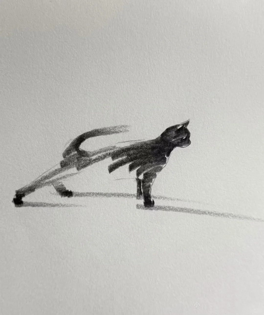
Fading Negative-Space Sketch
Turn people, animals, or still life into airy pencil sketches
Description
Recommended by
淡苍
Why we love this skill
Blends East Asian expressive negative space with loose Western sketching, preserving paper texture, broken lines, and fading dry-brush marks instead of photo realism or over-rendering.
Transform people, animals, facial close-ups, or still-life subjects into spontaneous Western pencil sketches with the expressive negative-space aesthetic of Eastern freehand painting. You can enter a subject description directly or provide a reference image to create a relaxed, distinctly unfinished sketch—not a photographic rendering or an overly polished digital portrait. The image uses only a few strokes to define key contours and expressions, leaving broad areas of the original paper blank across the face and within the subject. It avoids dense fur, delicate skin texture, and smooth shading. The neck, shoulders, or torso naturally blend into rough side-of-the-pencil strokes, broken lines, and dry-brush marks that gradually fade into the visible paper texture. The result feels like a practice sketch on a coarse-textured sketchbook page, suitable for portraits, animal studies, minimalist facial studies, and still-life concept sketches, with a restrained black-and-white graphite look and a quiet, poetic sense of space. Inspiration: Xiaohongshu comic artist blogger — 手訫
Related Skills
View all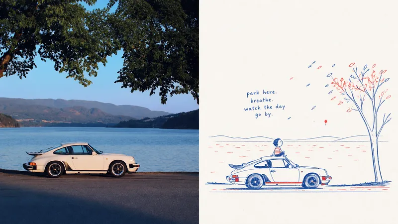 Image
ImageXiaoxiaodong x Doodle x P067
This prompt set captures the lively spirit of a sketch on scrap paper: ⚬ Pure red-and-blue ink: The entire image leaves out every other color, using only a vintage blue and tomato red with the texture of a ballpoint pen or crayon. The lines are fine, with slight signs of hand tremors and repeated tracing. The two colors are distributed unevenly, appearing naturally only in key contours and small areas of color. ⚬ One clear visual focal point: The background is deliberately not copied from the original image. Only the most essential action and expression are extracted, with room for a touch of innocent exaggeration in the proportions. The result is recognizable at a glance, yet much more humorous. ⚬ A clean, nearly white paper background: Broad areas of pure white space replace dirty, yellowed filters. Only a very subtle paper-fiber texture remains, keeping the image airy, as if it was just drawn. ⚬ A handwritten short phrase with baseline shifts: The text is no longer a rigid poster headline, but a childlike exclamation, sound effect, or conversational phrase written on the spur of the moment. Uneven strokes float in the empty space and naturally echo the red-and-blue arrows or small symbols. The upper half shows serious, realistic light and shadow; the lower half becomes a private observation notebook full of breathing room.
 Image
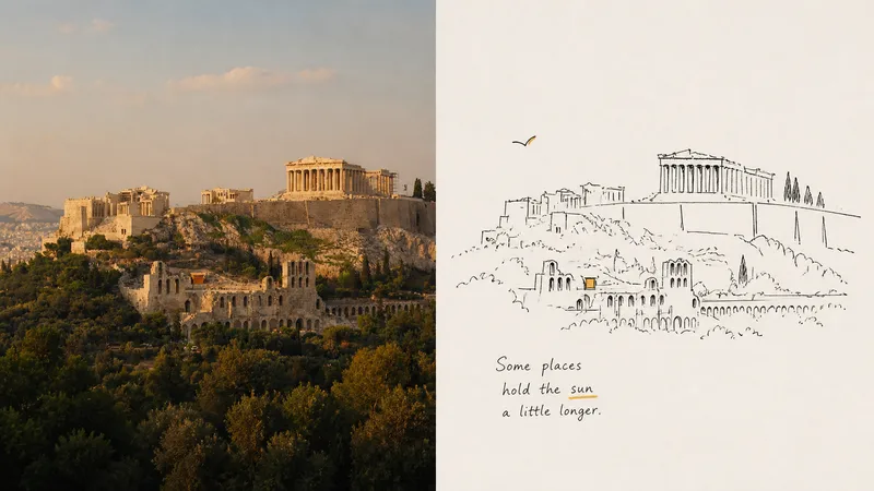
ImageXiaoxiaodong x Lines x Space x p062
For: Illustrators, fans of independent publication layouts, and people who enjoy a casual “sketchbook journal” style of recording. Core pain point: AI-generated “line art” always has a boring, overly orderly quality—the lines are too straight and smooth, like vector graphics traced in CAD, with none of the breath and spirit of drawing by hand on paper. I’ve always felt that the best drawings aren’t about “how accurately they’re drawn,” but about the relaxed quality of stopping after casually sketching just a couple of lines. The most ingenious part of this prompt is that it pushes AI to learn **“smart awkwardness”**: Run an image through it, and the lines that come out aren’t stiff digital outlines. They look as if you pulled a pocket pen from your bag and casually drew on a napkin or in a journal—the slight hand tremor, lines that don’t quite meet, and even the trace of correcting a mistake are all still there. ⚬ Top half: Preserve the original image and apply transparent, independent-publication photography color grading. ⚬ Bottom half: Throw away the complexity of the scene and use only minimalist black hand-drawn lines to capture the key person or action. ⚬ The image is almost entirely uncolored: Choose the most eye-catching color from the original photo (such as a corner of clothing or a roadside flower) and place it in a tiny area, like a flashback of a memory. Everything else is clean, pale background and generous negative space. ⚬ Beside it, follow the composition with one or two slightly quirky, humorous handwritten notes—part casual diary entry, part interior illustration from an independent art magazine. From a distance, the layout looks highly refined; up close, it’s full of gentle, vivid handmade marks.
 Image
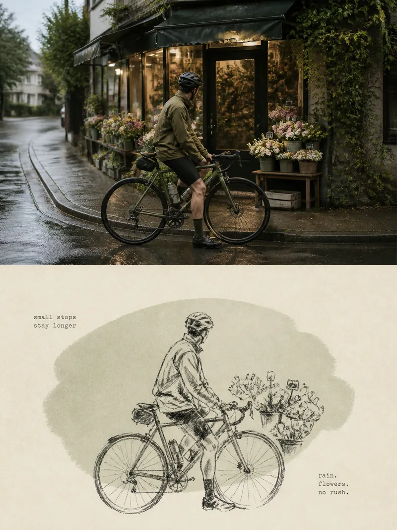
ImageXiaoxiaodong Crayon Sketch P075
Panel 075 preserves the subject’s most important proportions, direction, structure, and pose, then redraws them with loose, slightly corrected dark crayon lines. A low-saturation, irregular color field grown from the original image’s overall tones provides restrained support, while warm white handmade paper and generous blank space convey mood, distance, and time. A few tiny typewriter-style words resemble private notes without interrupting the image’s breathing room. Works well for Tired of formulaic vintage filters: The paper, grain, and imperfect lines all contribute to the narrative rather than acting as a uniform effect layered over a photo. Want to draw less while staying accurate: Details can remain unfinished, but the subject’s key proportions, direction, structure, and pose must remain recognizable. Prefer a quiet independent-publishing aesthetic: A soft monochrome color field, Risograph grain, generous negative space, and small typewriter text create a restrained layout. Need flexible delivery: Supports top-and-bottom, left-and-right, design-only, multiple aspect ratios, and four-sided wallpapers, as well as batch processing for image directories.
Fading Negative-Space Sketch
Turn people, animals, or still life into airy pencil sketches
Description
Recommended by
淡苍
Why we love this skill
Blends East Asian expressive negative space with loose Western sketching, preserving paper texture, broken lines, and fading dry-brush marks instead of photo realism or over-rendering.
Transform people, animals, facial close-ups, or still-life subjects into spontaneous Western pencil sketches with the expressive negative-space aesthetic of Eastern freehand painting. You can enter a subject description directly or provide a reference image to create a relaxed, distinctly unfinished sketch—not a photographic rendering or an overly polished digital portrait. The image uses only a few strokes to define key contours and expressions, leaving broad areas of the original paper blank across the face and within the subject. It avoids dense fur, delicate skin texture, and smooth shading. The neck, shoulders, or torso naturally blend into rough side-of-the-pencil strokes, broken lines, and dry-brush marks that gradually fade into the visible paper texture. The result feels like a practice sketch on a coarse-textured sketchbook page, suitable for portraits, animal studies, minimalist facial studies, and still-life concept sketches, with a restrained black-and-white graphite look and a quiet, poetic sense of space. Inspiration: Xiaohongshu comic artist blogger — 手訫
Related Skills
View allImageXiaoxiaodong x Doodle x P067
This prompt set captures the lively spirit of a sketch on scrap paper: ⚬ Pure red-and-blue ink: The entire image leaves out every other color, using only a vintage blue and tomato red with the texture of a ballpoint pen or crayon. The lines are fine, with slight signs of hand tremors and repeated tracing. The two colors are distributed unevenly, appearing naturally only in key contours and small areas of color. ⚬ One clear visual focal point: The background is deliberately not copied from the original image. Only the most essential action and expression are extracted, with room for a touch of innocent exaggeration in the proportions. The result is recognizable at a glance, yet much more humorous. ⚬ A clean, nearly white paper background: Broad areas of pure white space replace dirty, yellowed filters. Only a very subtle paper-fiber texture remains, keeping the image airy, as if it was just drawn. ⚬ A handwritten short phrase with baseline shifts: The text is no longer a rigid poster headline, but a childlike exclamation, sound effect, or conversational phrase written on the spur of the moment. Uneven strokes float in the empty space and naturally echo the red-and-blue arrows or small symbols. The upper half shows serious, realistic light and shadow; the lower half becomes a private observation notebook full of breathing room.
ImageXiaoxiaodong x Lines x Space x p062
For: Illustrators, fans of independent publication layouts, and people who enjoy a casual “sketchbook journal” style of recording. Core pain point: AI-generated “line art” always has a boring, overly orderly quality—the lines are too straight and smooth, like vector graphics traced in CAD, with none of the breath and spirit of drawing by hand on paper. I’ve always felt that the best drawings aren’t about “how accurately they’re drawn,” but about the relaxed quality of stopping after casually sketching just a couple of lines. The most ingenious part of this prompt is that it pushes AI to learn **“smart awkwardness”**: Run an image through it, and the lines that come out aren’t stiff digital outlines. They look as if you pulled a pocket pen from your bag and casually drew on a napkin or in a journal—the slight hand tremor, lines that don’t quite meet, and even the trace of correcting a mistake are all still there. ⚬ Top half: Preserve the original image and apply transparent, independent-publication photography color grading. ⚬ Bottom half: Throw away the complexity of the scene and use only minimalist black hand-drawn lines to capture the key person or action. ⚬ The image is almost entirely uncolored: Choose the most eye-catching color from the original photo (such as a corner of clothing or a roadside flower) and place it in a tiny area, like a flashback of a memory. Everything else is clean, pale background and generous negative space. ⚬ Beside it, follow the composition with one or two slightly quirky, humorous handwritten notes—part casual diary entry, part interior illustration from an independent art magazine. From a distance, the layout looks highly refined; up close, it’s full of gentle, vivid handmade marks.
ImageXiaoxiaodong Crayon Sketch P075
Panel 075 preserves the subject’s most important proportions, direction, structure, and pose, then redraws them with loose, slightly corrected dark crayon lines. A low-saturation, irregular color field grown from the original image’s overall tones provides restrained support, while warm white handmade paper and generous blank space convey mood, distance, and time. A few tiny typewriter-style words resemble private notes without interrupting the image’s breathing room. Works well for Tired of formulaic vintage filters: The paper, grain, and imperfect lines all contribute to the narrative rather than acting as a uniform effect layered over a photo. Want to draw less while staying accurate: Details can remain unfinished, but the subject’s key proportions, direction, structure, and pose must remain recognizable. Prefer a quiet independent-publishing aesthetic: A soft monochrome color field, Risograph grain, generous negative space, and small typewriter text create a restrained layout. Need flexible delivery: Supports top-and-bottom, left-and-right, design-only, multiple aspect ratios, and four-sided wallpapers, as well as batch processing for image directories.
Find your next favorite skill
Explore more curated AI skills for research, creation, and everyday work.