
Daily Abstract Thinking
Train abstract thinking with real-world cases
Description
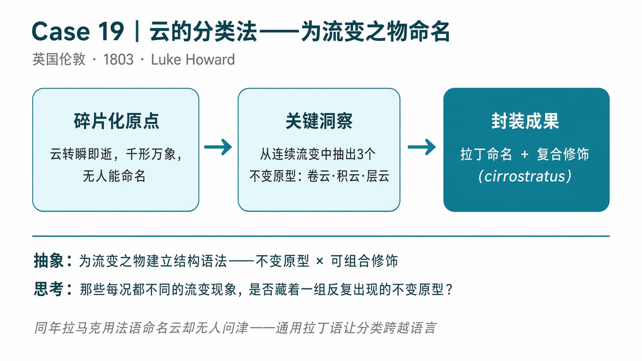
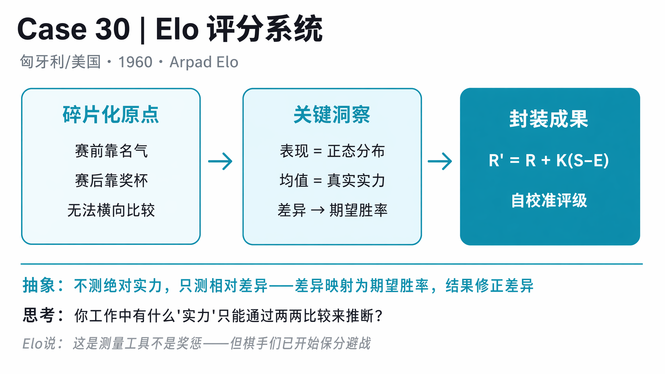
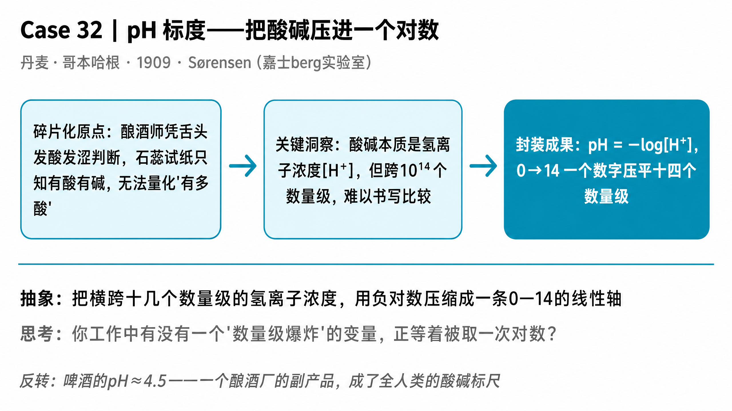
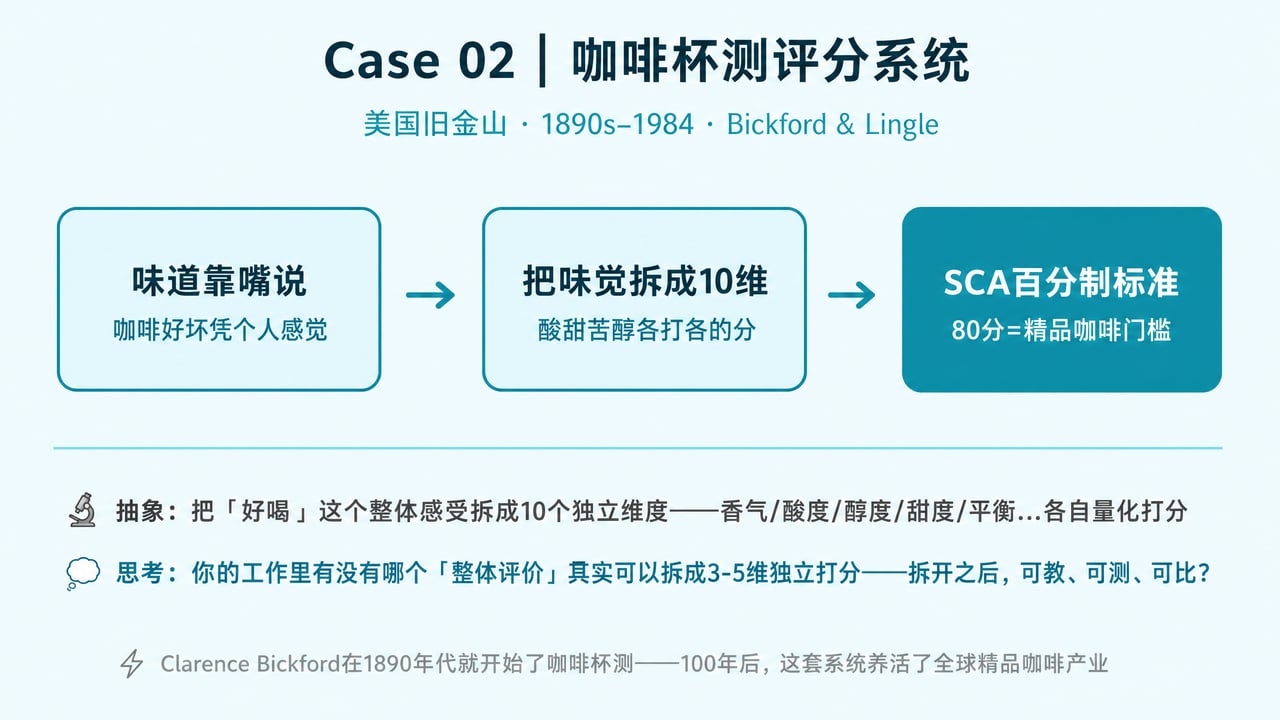
What does this Skill do? Every day, it introduces a real-world case: something that was once explored through experience and hands-on intuition, but was later distilled into a general method or standard (such as Braille or paper size standards). This process of turning specific experience into a general method is called abstraction. How can it help you? It builds one key ability: turning experience into methods. When you encounter a challenge, you can extract reusable patterns instead of starting from scratch every time. How do you use it? After installing it, just say "Give me one". Each day, it gives you a new case, along with an image and a reflection question that you can apply to your own work. Cases don’t repeat, and they come from a range of industries. Who is it for? Anyone who wants to turn experience into lasting knowledge instead of letting it become increasingly fragmented—useful for product work, investing, writing, management, and more.
Related Skills
View all
Idea to Infographic
A single image, a single sentence is all it takes. Have you ever had this experience—you have a great idea and want to turn it into an infographic like the ones big accounts post, but: - Open an AI image tool, rewrite prompts over and over, and the result either has terrible layout or completely mismatched style. - Tried several prompt templates, each requiring three or four adjustments, and half an hour later you're still not done. - Want styles like financial literacy, Chinese classic, science, tech... each time you have to research colors and layouts from scratch. Now you don't have to. 「Idea to Infographic」automates all of this: You say "make an emotion management infographic," and it decides whether to use a warm Chinese style or a healing scientific style, searches and organizes core knowledge points, breaks them into 6-8 module cards, assembles the optimal prompt, and quality-checks—if it fails, it automatically redoes; if it passes, it hands it right to you. Four killer capabilities, all built-in: 🧠 **Style Engine** — Not a rigid four-choice. If your topic matches financial literacy, it automatically goes with deep blue gold; if it matches Chinese classics, it uses rice paper and ink; if it matches technology, it uses cyan neon. For topics outside these four? It automatically synthesizes a new style. Coffee encyclopedia → food warm tones; exercise and fitness → vibrant orange gray. No style it can't handle. 🔍 **Content Brain** — You give a word, it searches the web to fill out content; you give a paragraph, it extracts the core; you give nothing but a topic, it organizes everything clearly. All three input methods are supported—the simpler, the more effortless. 📐 **Layout Adviser** — Progressive ladders, side-by-side comparisons, causal chains, overarching-subcategory radiation... Five logical patterns automatically matched. Not just stuffing text into an image, but actually designing an infographic. ✅ **Self-Inspection** — After generating, it automatically checks layout, text density, image-to-text ratio, and style match. If there's an issue, it adjusts and regenerates, up to two times. You don't need to know how to write prompts; you just need to know how to speak. **Who is this Skill for?** - Social media creators who need to produce images daily but don't want to learn design. - Knowledge commerce creators who want to visualize course content but lack a designer. - Corporate trainers who need professional infographics but lack budget for outsourcing. 🔍 - Anyone who wants to turn an idea into a great image. In a word: You have the idea, it has the image. All the hassle in between, it handles for you.

Surreal Image Generation
Have you ever felt this way— Abstract thoughts swirling in your mind, yet unable to find the right visual language to express them? Written a deep, insightful article, only to struggle endlessly for an accompanying image—ordinary photos too literal, illustrations lacking soul? Want to create a 'thoughtful' visual for your brand, only to end up with clichés that everyone else has already used? Stuck in a creative rut, scouring your asset library, only to find every image repeating yesterday's self... We desperately need a visual language that can 'read' the emotions, conflicts, and philosophy behind the text. And now, all it takes is a theme, a piece of text—leave the rest to it. What is it exactly? A smart creative tool that transforms abstract concepts and deep thoughts into surreal, wordless images with a single click. How to use it? Ridiculously simple. Enter any text: a sentence, a short essay, a philosophical proposition, or even a few fleeting keywords. Choose a ratio: 16:9, 4:3, 1:1... you decide. Click generate—and a surreal image full of philosophical depth and visual impact appears instantly. No drawing skills needed, no design experience required. You think, it sees. What makes its visual language stand out? It doesn't rely on realism or flatter prettiness. Instead, it uses the 'grammar' of surrealism to translate your thoughts: Scale paradox — a giant apple floating above a miniature city; Material alienation — books growing bones, clocks flowing into rivers; Spatial misconstruction — staircases leading to the sky, windows opening to another universe; Collage grafting — unrelated elements colliding into striking metaphors. In terms of color, it is restrained to the point of being cold—low-saturation, high-end grays as the main tone, with local high-saturation highlights at key points, creating a dreamlike detachment and silent astonishment. Every frame is clean, exquisite, and balanced, uniformly using a pure white background—extreme simplicity to accentuate extreme absurdity. Where can it be used? Art creation for inspiration — let the subconscious surface as images; Concept covers / album visuals — instantly captivating at first glance; Deep articles / poetry illustrations — image and text resonate, striking the heart; Brand visual extension — create a unique, story-rich visual identity.
Thinking Cocoon Breaker Lite
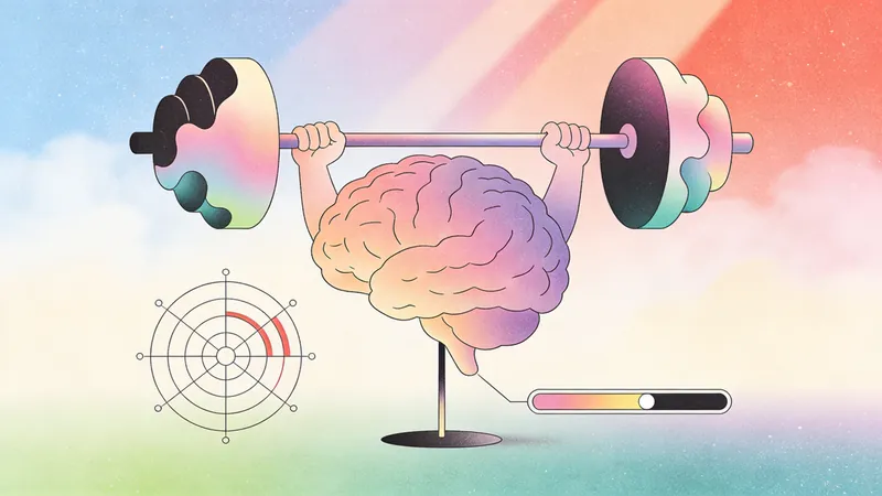
Critical Thinking Cocoon Breaker Everyone says critical thinking is the most important skill in the AI era — but where do you practice it? A real gap "Critical thinking is the most important ability in the AI era" — you've heard this a hundred times. But then what? No one tells you where to practice. You go to the gym to build muscle, driving school to learn to drive, and test prep to pass the driving test — but critical thinking? Where do you go? Read articles? Those are someone else's thoughts. Listen to podcasts? Those are someone else's conversations. Scroll short videos? Those are prechewed for you. If you don't think it through yourself, it's never yours. Critical Thinking Cocoon Breaker was born for this gap — a 10-minute daily thinking gym. --- How it works - Choose a topic — AI recommends 3–5 thought‑provoking topics from the day's news, or you can submit your own. - Choose depth — 1 to 4 rounds, up to you. Recommended: 2 rounds, just 10 minutes. - Share your view — 100–200 words. Doesn't need to be perfect, just honest. - AI plays devil's advocate — not to attack you, but to give you new information, perspectives, and angles to think things through together. - Cognitive checkup — a 5‑dimension blind‑spot profile plus 3‑dimension critical thinking scores. See what you can't see. - Stand‑up reward — after the debate, get a personalized comedy bit and story card to make you smile while waking you up. --- Winning a debate ≠ thinking it through. --- Three truths 1. Most people don't lack the desire to think critically — they lack a setting. Commute time, lunch break, 10 minutes before bed — that's your thinking arena. 2. Critical thinking is not talent — it's a muscle. Neglect it and it atrophies; exercise it and it grows. One 10‑minute session, and after ten you'll feel the difference. 3. The biggest blind spot is not knowing you have one. The 5‑dimension cognitive blind‑spot profile shines a light where you can't see yourself. --- In one sentence: It's not about making you win — it's about helping you see. ⚠️ Important notice: This skill is designed solely to create a training scenario for improving critical thinking. The debate process and conclusions represent personal viewpoints on specific topics; there is no right or wrong. It does not constitute a definitive judgment on any event.
Daily Abstract Thinking
Train abstract thinking with real-world cases
Description
What does this Skill do? Every day, it introduces a real-world case: something that was once explored through experience and hands-on intuition, but was later distilled into a general method or standard (such as Braille or paper size standards). This process of turning specific experience into a general method is called abstraction. How can it help you? It builds one key ability: turning experience into methods. When you encounter a challenge, you can extract reusable patterns instead of starting from scratch every time. How do you use it? After installing it, just say "Give me one". Each day, it gives you a new case, along with an image and a reflection question that you can apply to your own work. Cases don’t repeat, and they come from a range of industries. Who is it for? Anyone who wants to turn experience into lasting knowledge instead of letting it become increasingly fragmented—useful for product work, investing, writing, management, and more.
Related Skills
View allIdea to Infographic
A single image, a single sentence is all it takes. Have you ever had this experience—you have a great idea and want to turn it into an infographic like the ones big accounts post, but: - Open an AI image tool, rewrite prompts over and over, and the result either has terrible layout or completely mismatched style. - Tried several prompt templates, each requiring three or four adjustments, and half an hour later you're still not done. - Want styles like financial literacy, Chinese classic, science, tech... each time you have to research colors and layouts from scratch. Now you don't have to. 「Idea to Infographic」automates all of this: You say "make an emotion management infographic," and it decides whether to use a warm Chinese style or a healing scientific style, searches and organizes core knowledge points, breaks them into 6-8 module cards, assembles the optimal prompt, and quality-checks—if it fails, it automatically redoes; if it passes, it hands it right to you. Four killer capabilities, all built-in: 🧠 **Style Engine** — Not a rigid four-choice. If your topic matches financial literacy, it automatically goes with deep blue gold; if it matches Chinese classics, it uses rice paper and ink; if it matches technology, it uses cyan neon. For topics outside these four? It automatically synthesizes a new style. Coffee encyclopedia → food warm tones; exercise and fitness → vibrant orange gray. No style it can't handle. 🔍 **Content Brain** — You give a word, it searches the web to fill out content; you give a paragraph, it extracts the core; you give nothing but a topic, it organizes everything clearly. All three input methods are supported—the simpler, the more effortless. 📐 **Layout Adviser** — Progressive ladders, side-by-side comparisons, causal chains, overarching-subcategory radiation... Five logical patterns automatically matched. Not just stuffing text into an image, but actually designing an infographic. ✅ **Self-Inspection** — After generating, it automatically checks layout, text density, image-to-text ratio, and style match. If there's an issue, it adjusts and regenerates, up to two times. You don't need to know how to write prompts; you just need to know how to speak. **Who is this Skill for?** - Social media creators who need to produce images daily but don't want to learn design. - Knowledge commerce creators who want to visualize course content but lack a designer. - Corporate trainers who need professional infographics but lack budget for outsourcing. 🔍 - Anyone who wants to turn an idea into a great image. In a word: You have the idea, it has the image. All the hassle in between, it handles for you.
Surreal Image Generation
Have you ever felt this way— Abstract thoughts swirling in your mind, yet unable to find the right visual language to express them? Written a deep, insightful article, only to struggle endlessly for an accompanying image—ordinary photos too literal, illustrations lacking soul? Want to create a 'thoughtful' visual for your brand, only to end up with clichés that everyone else has already used? Stuck in a creative rut, scouring your asset library, only to find every image repeating yesterday's self... We desperately need a visual language that can 'read' the emotions, conflicts, and philosophy behind the text. And now, all it takes is a theme, a piece of text—leave the rest to it. What is it exactly? A smart creative tool that transforms abstract concepts and deep thoughts into surreal, wordless images with a single click. How to use it? Ridiculously simple. Enter any text: a sentence, a short essay, a philosophical proposition, or even a few fleeting keywords. Choose a ratio: 16:9, 4:3, 1:1... you decide. Click generate—and a surreal image full of philosophical depth and visual impact appears instantly. No drawing skills needed, no design experience required. You think, it sees. What makes its visual language stand out? It doesn't rely on realism or flatter prettiness. Instead, it uses the 'grammar' of surrealism to translate your thoughts: Scale paradox — a giant apple floating above a miniature city; Material alienation — books growing bones, clocks flowing into rivers; Spatial misconstruction — staircases leading to the sky, windows opening to another universe; Collage grafting — unrelated elements colliding into striking metaphors. In terms of color, it is restrained to the point of being cold—low-saturation, high-end grays as the main tone, with local high-saturation highlights at key points, creating a dreamlike detachment and silent astonishment. Every frame is clean, exquisite, and balanced, uniformly using a pure white background—extreme simplicity to accentuate extreme absurdity. Where can it be used? Art creation for inspiration — let the subconscious surface as images; Concept covers / album visuals — instantly captivating at first glance; Deep articles / poetry illustrations — image and text resonate, striking the heart; Brand visual extension — create a unique, story-rich visual identity.
Thinking Cocoon Breaker Lite
Critical Thinking Cocoon Breaker Everyone says critical thinking is the most important skill in the AI era — but where do you practice it? A real gap "Critical thinking is the most important ability in the AI era" — you've heard this a hundred times. But then what? No one tells you where to practice. You go to the gym to build muscle, driving school to learn to drive, and test prep to pass the driving test — but critical thinking? Where do you go? Read articles? Those are someone else's thoughts. Listen to podcasts? Those are someone else's conversations. Scroll short videos? Those are prechewed for you. If you don't think it through yourself, it's never yours. Critical Thinking Cocoon Breaker was born for this gap — a 10-minute daily thinking gym. --- How it works - Choose a topic — AI recommends 3–5 thought‑provoking topics from the day's news, or you can submit your own. - Choose depth — 1 to 4 rounds, up to you. Recommended: 2 rounds, just 10 minutes. - Share your view — 100–200 words. Doesn't need to be perfect, just honest. - AI plays devil's advocate — not to attack you, but to give you new information, perspectives, and angles to think things through together. - Cognitive checkup — a 5‑dimension blind‑spot profile plus 3‑dimension critical thinking scores. See what you can't see. - Stand‑up reward — after the debate, get a personalized comedy bit and story card to make you smile while waking you up. --- Winning a debate ≠ thinking it through. --- Three truths 1. Most people don't lack the desire to think critically — they lack a setting. Commute time, lunch break, 10 minutes before bed — that's your thinking arena. 2. Critical thinking is not talent — it's a muscle. Neglect it and it atrophies; exercise it and it grows. One 10‑minute session, and after ten you'll feel the difference. 3. The biggest blind spot is not knowing you have one. The 5‑dimension cognitive blind‑spot profile shines a light where you can't see yourself. --- In one sentence: It's not about making you win — it's about helping you see. ⚠️ Important notice: This skill is designed solely to create a training scenario for improving critical thinking. The debate process and conclusions represent personal viewpoints on specific topics; there is no right or wrong. It does not constitute a definitive judgment on any event.
Find your next favorite skill
Explore more curated AI skills for research, creation, and everyday work.