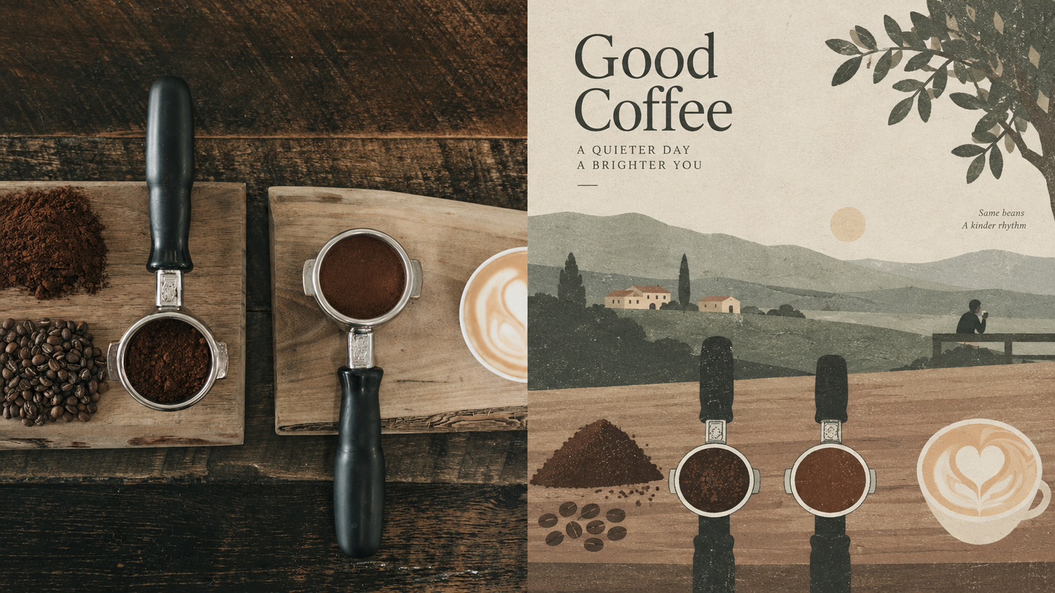
GPT2 x Horizontal Folk Art
By xiaoxiaodong · P232
GPT2 x Horizontal Folk Art
By xiaoxiaodong · P232
Showcase
Description
Ideal for turning photos into quiet, detached, place-aware editorial illustrations with a modern folk-art sensibility—for independent publishing, exhibition studies, and local visual work. The upper half preserves the recognizable source image; the lower half compresses the scene into shallow horizontal bands of color—fields, roads, walls, rooftops, and trees—with extremely low density and generous negative space. If people appear, they are tiny, isolated points. Matte paper, subtle screen-print grain, and the texture of vintage book illustrations. A highly desaturated palette—gray-green, sage, warm beige, light gray, faded burgundy, and earth brown—compressed from the original image. Overcast, diffused light. Avoid high saturation, fluorescents, heavy rendering, a slick digital feel, and commercial titles.
Recommended by
Dancang
Why we love this skill
Quiet folk-art modernism emerges through low-density horizontal layers, faded color bands, paper and screen-print grain, generous whitespace, and tiny figures—distinct from bright, crowded landscape generations.
Related Skills
View all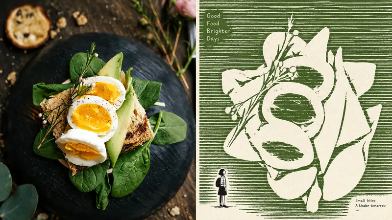 Image
GPT2 x Negative Monument
For turning everyday photos into minimalist independent-publication illustrations: exhibition studies, personal photography projects, and literary visuals. The upper half retains a recognizable version of the original photo; the lower half does not depict the subject, but instead builds a field of dense, slightly shaky, broken horizontal strokes, leaving the subject as a huge, quiet expanse of negative space. A tiny, naïve figure contrasts with, passes through, or accompanies this monument. Use no more than three colors: a warm white paper ground, one soft, bright ink color drawn from the source image, and black. The image must use flat graphic forms while retaining paper texture and slight misregistration. Avoid volumetric rendering, gradients, shadows, smooth digital rendering, and flashy multicolor treatments.
 Image
GPT2 x Indie Paper Object
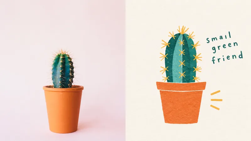
For turning everyday photos into the kind of handmade paper piece you might find in an independent bookstore, design museum shop, or small art market: personal photo curation, independent publishing, exhibition exercises, and lifestyle brands. The upper half preserves a recognizable version of the original photo; the lower half does not apply a paper-cut filter, but removes irrelevant information and reworks it into a small paper-art object using naive hand-drawing, paper-cut color blocks, rough geometric shapes, and a few simple lines. The overall look is clean, friendly, optimistic, relaxed, and slightly quirky: a medium-to-small scale, generous warm-white space, matte paper and Risograph grain, and 2–3 spot colors sampled from the original image. Avoid realistic illustration, smooth vector graphics, a glossy 3D plastic feel, complex backgrounds, commercial packaging, children's craft-class aesthetics, and templated brand design.
 Image
GPT2 x Naive Hand-Drawn
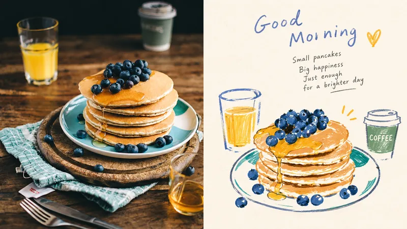
Ideal for turning everyday photos into contemporary naïve hand-drawn art for personal albums, independent stationery, and small-scale art publishing. The top half preserves the recognizable original photo; the bottom half keeps only its most soulful shapes, reinterpreted with loose, slightly wobbly colored outlines, marker, and colored pencil. Keep the subject small, surrounded by warm cream white. Draw a few of the most expressive colors from the original image. Keep them warm and matte, with select areas allowed to be slightly more vivid. Preserve paper grain, overrun lines, and pauses. Avoid smooth vectors, polished edges, complex shadows, 3D, and formal commercial titles.
Information
- Version
- v4
- Last updated
- Runtime credits
- Usage-based
- Models
- Auto