Elevate Frontend Aesthetics
Instructions
Avoid mediocre "AI slop" aesthetics and create a surprisingly unique front end.
## Five Core Dimensions
**1. Typography**
- ❌ Prohibited: Inter, Roboto, Arial, System Fonts
- ✅ Choose: Unique, distinctive fonts
- ✅ Combination: Showcase font + Body font, high contrast
- ✅ Tips: Extreme font weight contrast (100 vs 900), large font size range (3x+)
**2. Color & Theme**
- ✅ Maintain a consistent aesthetic by using CSS variables.
- ✅ Dominant color + vibrant accent color
- ❌ Avoid: Purple gradient + white background
- ✅ Inspiration: IDE themes, cultural aesthetics
**3. Motion**
- ✅ CSS animations take precedence (HTML)
- ✅ Motion Library
- ✅ Focus on High Impact: A Carefully Curated Page Load > Scattered Micro-Interactions
- ✅ Scroll trigger, hover surprise
**4. Spatial Layout**
- ✅ Asymmetrical, overlapping, diagonal flow
- ✅ Break the grid, bold use of white space OR controlled density
**5. Background Details**
- ✅ Create atmosphere and depth
- ✅ Gradient mesh, noise, geometric patterns
- ✅ Layered transparency, dramatic shadows, decorative borders
## Key Principles
- Each design should be different to avoid repetitive convergence.
- Achieving a complexity-matched aesthetic vision
Extreme complexity requires meticulous design, while minimalism requires restraint and precision.
- Break free from conventional thinking and make truly unique choices
⚡ One-line summary
Unique font + bold color scheme + meticulous animation + innovative layout + atmospheric background = unforgettable front-end design
Reject: Inter/Roboto, purple gradient white background, monotonous layout
📋 Quick Checklist
Dimensions and Inspection Items
Should the fonts avoid Inter/Roboto? Are there any unique color combinations?
Does the color scheme have a unified theme? Should purple gradients be avoided?
Does the animation have a carefully choreographed loading effect?
Does the layout deviate from the conventional grid?
Does the background create depth and atmosphere?
Description
Recommended by
nene@YouMind
Why we love this skill
Tired of the same old 'AI slop' design? This skill will help you break free from mediocrity, creating stunning front-end interfaces with unique typography, bold colors, subtle animations, innovative spatial layouts, and deeply atmospheric backgrounds. It offers a practical aesthetic guide to make your work stand out from the crowd and achieve a true visual breakthrough.
Unique font personality, dark cyberpunk aesthetics, asymmetric dynamic layout, carefully orchestrated loading animations, and immersive atmosphere creation.
Related Skills
View all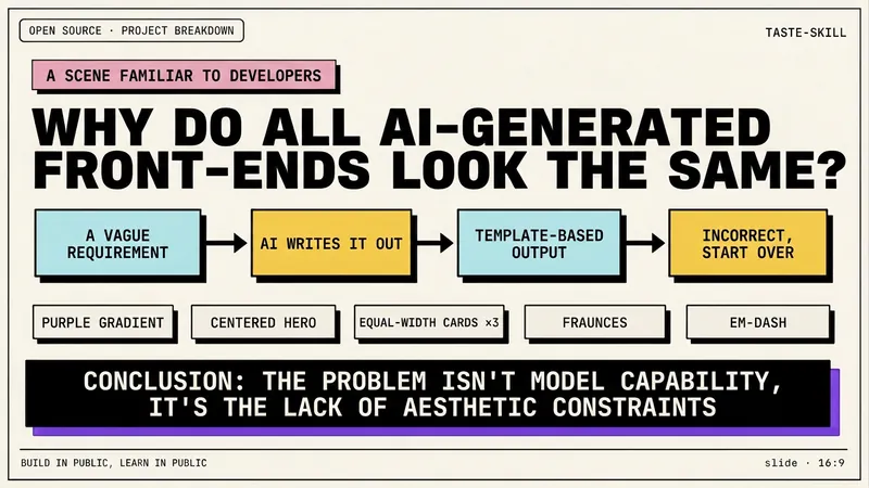 Slides
Dev New Brutalism Editorial
Turn your topic content, articles, knowledge points, project retrospectives, course copy, or tool introductions into a set of horizontal Slides with a 'Developer New Brutalism Editorial Style.' The overall style blends New Brutalism design, indie magazine layout, and developer terminal aesthetics: beige background, thick black borders, hard shadows, high-contrast color blocks, oversized titles, monospaced fonts, and web/terminal/card modular layouts, creating a strong sense of technical content expression. This skill first refines the content structure, then determines a core point for each page, automatically generating titles, explanatory sentences, knowledge point modules, conclusions, and appropriate visual components. It is especially suitable for AI tool introductions, Agent practice, open-source project breakdowns, course content organization, methodology summaries, product feature explanations, and technical retrospectives. The final output is a set of 16:9 horizontal Slides with a unified visual appearance, clear readability, ample white space, and distinct style, presenting an advanced expression effect that feels 'like an open-source project author sharing technical knowledge, yet like an indie design magazine telling a story.'
 Image
ImageHan Stone Relief Poster
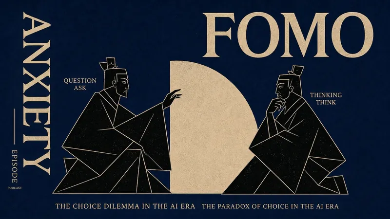
A visual system extracted from Han stone reliefs: geometric silhouette figures × classical background colors × asymmetric editorial layout. Suitable for event posters, live stream previews, podcast covers, and more. You just say the theme, and it carves modern content into the aesthetics of two thousand years.
 Write
WriteDan Koe Style Viral Headlines
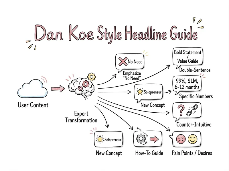
Generate 7 headlines for your content, each representing a core stylistic feature of Dan Koe, ensuring diversity and choice. This is a headline creation expert skilled in viral psychology and Dan Koe's content aesthetics. Designed for creators, personal brand builders, and digital nomads, it transforms your dull topics into viral headlines with a 'thought leader' feel. 🌟 Core Capabilities Deep Content Analysis: Automatically extracts core pain points, audience profiles, and value propositions from fragmented keywords or lengthy scripts. Seven Golden Dimensions: Strictly follows Dan Koe's visual logic to generate 7 distinctly different angles at once.
Elevate Frontend Aesthetics
Instructions
Avoid mediocre "AI slop" aesthetics and create a surprisingly unique front end.
## Five Core Dimensions
**1. Typography**
- ❌ Prohibited: Inter, Roboto, Arial, System Fonts
- ✅ Choose: Unique, distinctive fonts
- ✅ Combination: Showcase font + Body font, high contrast
- ✅ Tips: Extreme font weight contrast (100 vs 900), large font size range (3x+)
**2. Color & Theme**
- ✅ Maintain a consistent aesthetic by using CSS variables.
- ✅ Dominant color + vibrant accent color
- ❌ Avoid: Purple gradient + white background
- ✅ Inspiration: IDE themes, cultural aesthetics
**3. Motion**
- ✅ CSS animations take precedence (HTML)
- ✅ Motion Library
- ✅ Focus on High Impact: A Carefully Curated Page Load > Scattered Micro-Interactions
- ✅ Scroll trigger, hover surprise
**4. Spatial Layout**
- ✅ Asymmetrical, overlapping, diagonal flow
- ✅ Break the grid, bold use of white space OR controlled density
**5. Background Details**
- ✅ Create atmosphere and depth
- ✅ Gradient mesh, noise, geometric patterns
- ✅ Layered transparency, dramatic shadows, decorative borders
## Key Principles
- Each design should be different to avoid repetitive convergence.
- Achieving a complexity-matched aesthetic vision
Extreme complexity requires meticulous design, while minimalism requires restraint and precision.
- Break free from conventional thinking and make truly unique choices
⚡ One-line summary
Unique font + bold color scheme + meticulous animation + innovative layout + atmospheric background = unforgettable front-end design
Reject: Inter/Roboto, purple gradient white background, monotonous layout
📋 Quick Checklist
Dimensions and Inspection Items
Should the fonts avoid Inter/Roboto? Are there any unique color combinations?
Does the color scheme have a unified theme? Should purple gradients be avoided?
Does the animation have a carefully choreographed loading effect?
Does the layout deviate from the conventional grid?
Does the background create depth and atmosphere?
Description
Recommended by
nene@YouMind
Why we love this skill
Tired of the same old 'AI slop' design? This skill will help you break free from mediocrity, creating stunning front-end interfaces with unique typography, bold colors, subtle animations, innovative spatial layouts, and deeply atmospheric backgrounds. It offers a practical aesthetic guide to make your work stand out from the crowd and achieve a true visual breakthrough.
Unique font personality, dark cyberpunk aesthetics, asymmetric dynamic layout, carefully orchestrated loading animations, and immersive atmosphere creation.
Related Skills
View allSlidesDev New Brutalism Editorial
Turn your topic content, articles, knowledge points, project retrospectives, course copy, or tool introductions into a set of horizontal Slides with a 'Developer New Brutalism Editorial Style.' The overall style blends New Brutalism design, indie magazine layout, and developer terminal aesthetics: beige background, thick black borders, hard shadows, high-contrast color blocks, oversized titles, monospaced fonts, and web/terminal/card modular layouts, creating a strong sense of technical content expression. This skill first refines the content structure, then determines a core point for each page, automatically generating titles, explanatory sentences, knowledge point modules, conclusions, and appropriate visual components. It is especially suitable for AI tool introductions, Agent practice, open-source project breakdowns, course content organization, methodology summaries, product feature explanations, and technical retrospectives. The final output is a set of 16:9 horizontal Slides with a unified visual appearance, clear readability, ample white space, and distinct style, presenting an advanced expression effect that feels 'like an open-source project author sharing technical knowledge, yet like an indie design magazine telling a story.'
ImageHan Stone Relief Poster
A visual system extracted from Han stone reliefs: geometric silhouette figures × classical background colors × asymmetric editorial layout. Suitable for event posters, live stream previews, podcast covers, and more. You just say the theme, and it carves modern content into the aesthetics of two thousand years.
WriteDan Koe Style Viral Headlines
Generate 7 headlines for your content, each representing a core stylistic feature of Dan Koe, ensuring diversity and choice. This is a headline creation expert skilled in viral psychology and Dan Koe's content aesthetics. Designed for creators, personal brand builders, and digital nomads, it transforms your dull topics into viral headlines with a 'thought leader' feel. 🌟 Core Capabilities Deep Content Analysis: Automatically extracts core pain points, audience profiles, and value propositions from fragmented keywords or lengthy scripts. Seven Golden Dimensions: Strictly follows Dan Koe's visual logic to generate 7 distinctly different angles at once.
Find your next favorite skill
Explore more curated AI skills for research, creation, and everyday work.